Rainbow Logo Design
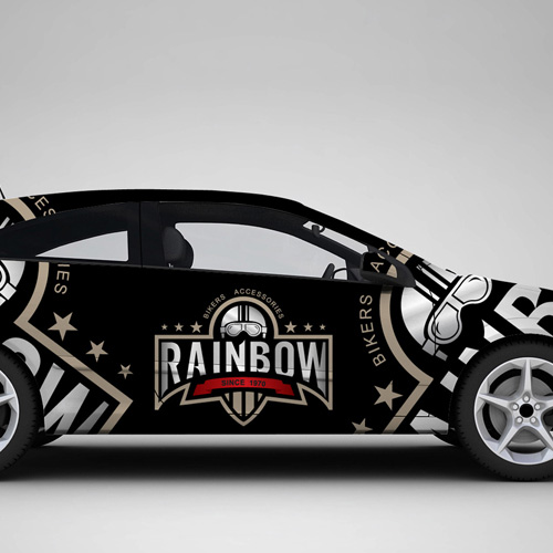
Handled: Logo Design, Automobiles
Client Name: Rainbow
Industry: Bikers Accessories
City: Chennai
Country: India
Other designs handled for Rainbow
Crafting a Passion-Oriented Logo by get noticed team for the brand name RAINBOW: Revamping Bikers Accessories in Chennai
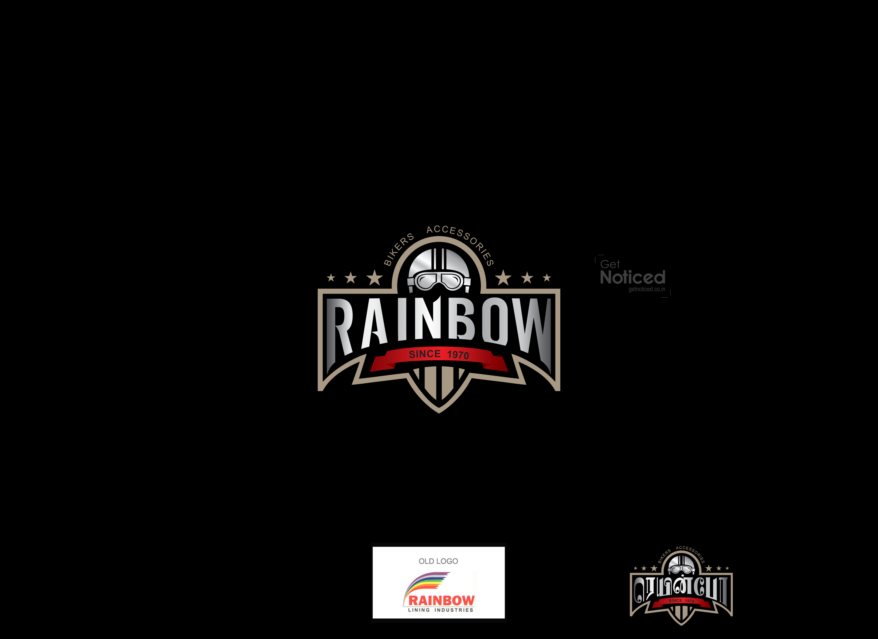
Introduction: Since its establishment in 1970, RAINBOW, a prominent Bikers Accessories showroom in Chennai, has been recognized for its iconic logo featuring rainbow rays and colors. However, with the aim of attracting a younger audience and reflecting the showroom's commitment to high-quality international brands, RAINBOW approached our creative design team for a refreshed logo. This article explores the journey of how our team crafted a logo that resonates with the passion of young bikers and motorcycle enthusiasts.
Understanding the Requirement: Upon a client recommendation, RAINBOW expressed their desire to update their logo while maintaining its success and legacy. The client emphasized the need to appeal to the younger generation, who have a deep love for biking and an affinity for high-quality motorcycle accessories. Our team was given complete freedom to innovate and create a logo that would capture the essence of this target audience.
The Creative Process: Our designers embarked on a journey to explore new possibilities, breaking away from the traditional rainbow rays and colors. We brainstormed ideas, seeking inspiration from the vibrant biking community and the spirit of adventure. After a comprehensive discussion, we presented the client with five distinct logo options, each designed to evoke a sense of passion and appeal to the young biking enthusiasts.
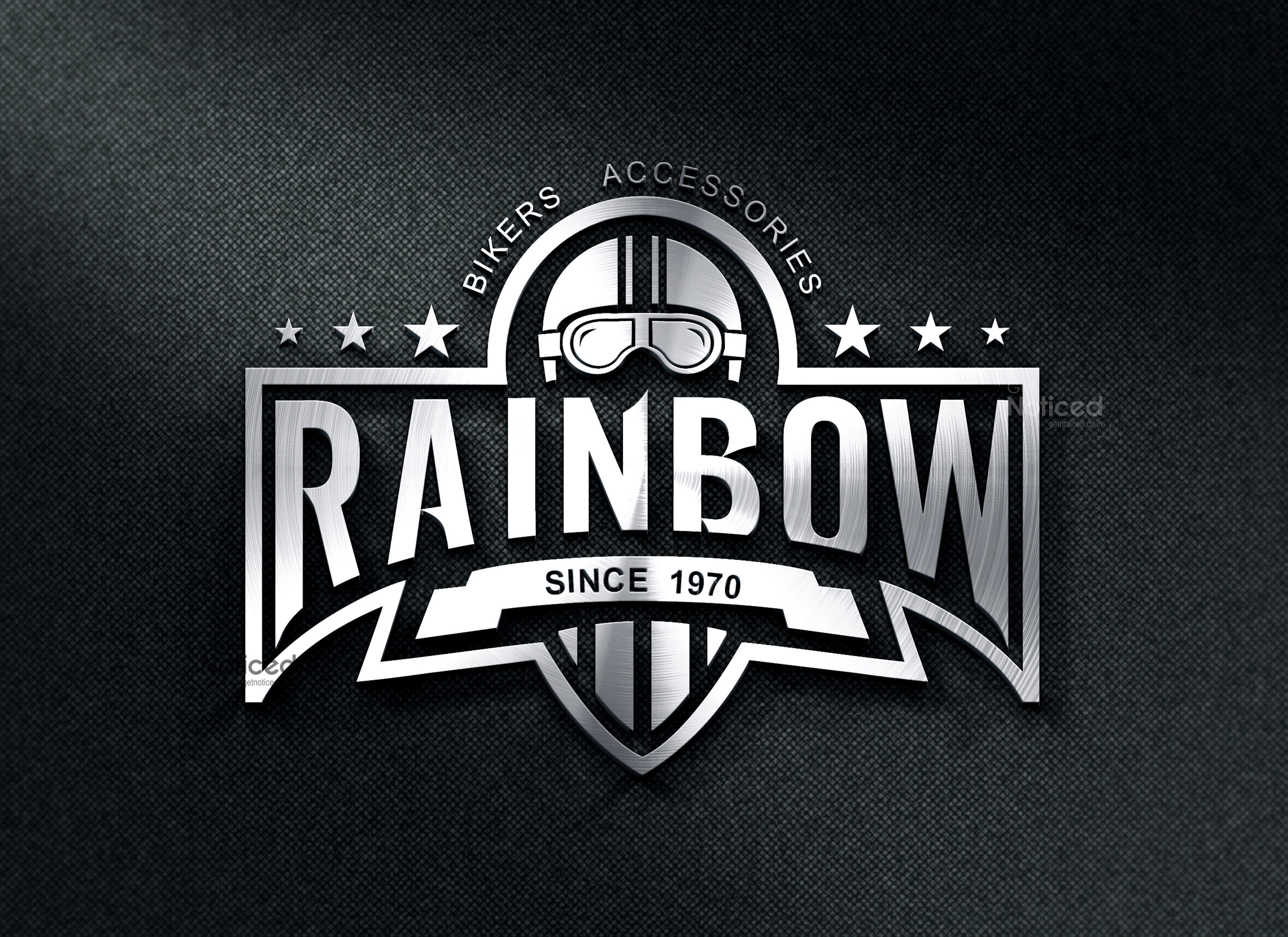
The Chosen Logo: Out of the five options, one logo stood out, captivating the client's attention. It featured a classic look that exuded passion and elegance. The design showcased a unique combination of elements, capturing the essence of the biking experience. The client was enthralled by the logo, making it their immediate and unequivocal choice.
The Logo's Impact: As a creative team, witnessing individuals proudly wearing the RAINBOW logo on their helmets fills us with immense pride. The logo has become a symbol of identity and quality for bikers across the city. It serves as a testament to our team's ability to understand the client's vision, craft an innovative design, and connect with the targeted audience successfully.
Conclusion: The process of revamping the logo for RAINBOW, a renowned Bikers Accessories showroom in Chennai, was an exciting and fulfilling journey for our creative design team. By departing from the traditional rainbow rays and colors and embracing a passion-oriented approach, we created a logo that resonates with young bikers and motorcycle enthusiasts. Witnessing the logo's impact on the biking community and the pride it instils within us further affirms the success of our collaboration with RAINBOW.


