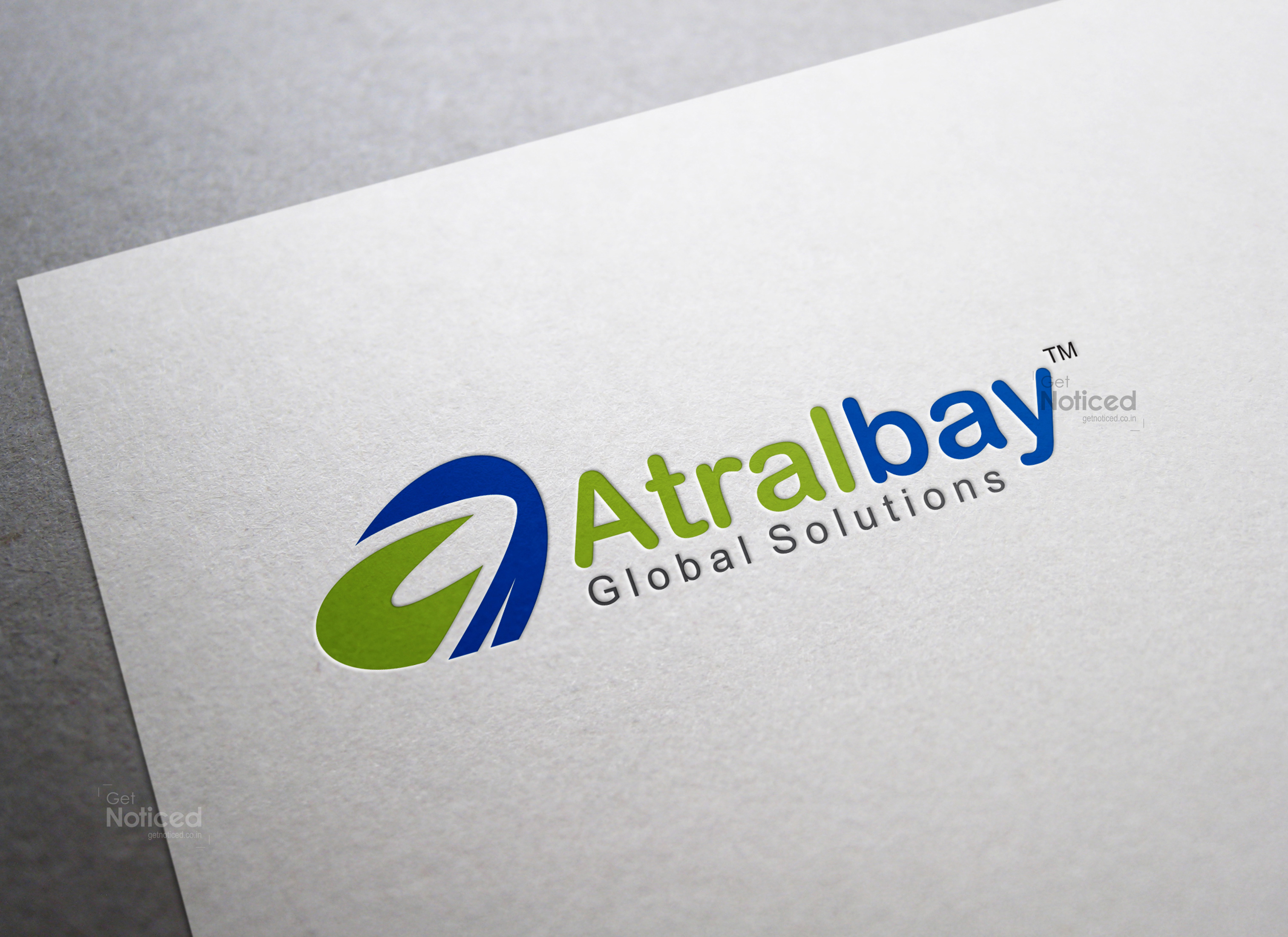
Atralbay Logo Design
Handled: Logo Design, Education & Training
Client Name: Atralbay Global Solutions
Industry: Education System
City: chennai
Country: india
Other designs handled for Atralbay Global Solutions
ARTAL Bay Logo design by get noticed : A Logo That Captures the Essence of Education and Growth
Introduction: In the competitive world of start-ups, establishing a strong brand identity is crucial. One significant aspect of branding is the logo, which serves as the visual representation of a company's values, mission, and vision. For ARTAL Bay, an education software system training academy based in London, the logo design process was a unique journey. With a desire to expand their venture to India, the team embarked on creating a logo that would resonate with both Tamil and English-speaking audiences. After multiple iterations and client feedback, a final logo was selected, capturing the essence of education and growth.
Combining Cultures: The first challenge faced by the designing team was to merge the Tamil word "atral" with the English word "bay" into a cohesive logo. By incorporating the letter 'A' as the central element, they managed to strike a balance between the two languages, symbolizing the convergence of diverse cultures and languages. This clever fusion not only portrays the company's international aspirations but also connects with the target audience in India.
Logo Options: Presenting multiple logo options is a standard practice for the designing team, ensuring the client has a wide range of choices. In the case of ATRAL Bay, the team brainstormed and developed five distinct logo concepts. Each option was thoughtfully crafted to convey the core values of education, professionalism, and innovation.
Client Preference: After a comprehensive presentation of the logo options, the client expressed a strong affinity towards one particular design. This final logo, with a few color combination revisions, was selected as the representative face of ATRAL Bay. The chosen design resonated with the client's vision and perfectly encapsulated the essence of the brand.
symbolism and Meaning: The final logo of ATRAL Bay incorporates a bold, stylized 'A' that stands tall and firm. The simplicity of the design is intentional, representing the fundamental principles of clarity and effectiveness in education. The letter 'A' also signifies the first step towards knowledge, reflecting the company's commitment to providing a strong foundation for learners. The vibrant color palette used in the logo evokes a sense of energy, enthusiasm, and growth, aligning perfectly with the academy's educational goals.
Implementation and Impact: With the final logo design in hand, ATRAL Bay wasted no time in implementing it across various platforms and touch points. From their website and social media profiles to marketing collaterals and merchandise, the logo now serves as a visual ambassador for the brand. By consistently using the logo, the academy builds recognition and familiarity among its target audience, establishing a strong brand presence.
Conclusion: A well-designed logo can be a powerful tool in creating a lasting impression for a start-up. For ATRAL Bay, the process of designing a logo that merged Tamil and English words was a testament to their commitment to cross-cultural collaboration. The chosen logo design, with its symbolic 'A' and vibrant colors, effectively represents the company's mission of providing quality education and growth opportunities. As ATRAL Bay expands its venture to India, their thoughtfully crafted logo will play a pivotal role in establishing a strong foothold in the educational software system training industry.


