Bruno Logo Design
Handled: Logo Design, Education & Training
Client Name: Bruno
Industry: English Speaking Academy
City: Coimbatore, Tamilnadu
Country: India
Other designs handled for Bruno
Crafting the Perfect Logo: The Journey of Bruno English Speaking Training Center's Creative Designing Team get noticed
A logo serves as the face of a brand, encapsulating its essence and values in a visual form. When Bruno English Speaking Training Center, a renowned academy specializing in English language training, approached our creative designing team, we knew that creating a logo to represent their exceptional services would be no ordinary task. This is the story of how our team meticulously crafted a logo that captured Bruno's vision and garnered attention.
The first step in the logo design process was to understand the client's expectations. Through an in-depth interview, we explored Bruno's core values, their commitment to accuracy in English language training, and their desired image. Armed with this knowledge, our team embarked on the journey to create a logo that would resonate with their target audience.
To kickstart the design process, our team prepared four sample logos, each showcasing a distinct concept. These samples were carefully crafted to encompass the essence of Bruno's services. After a thoughtful review, the client was drawn to a logo that symbolized communication and conversation.
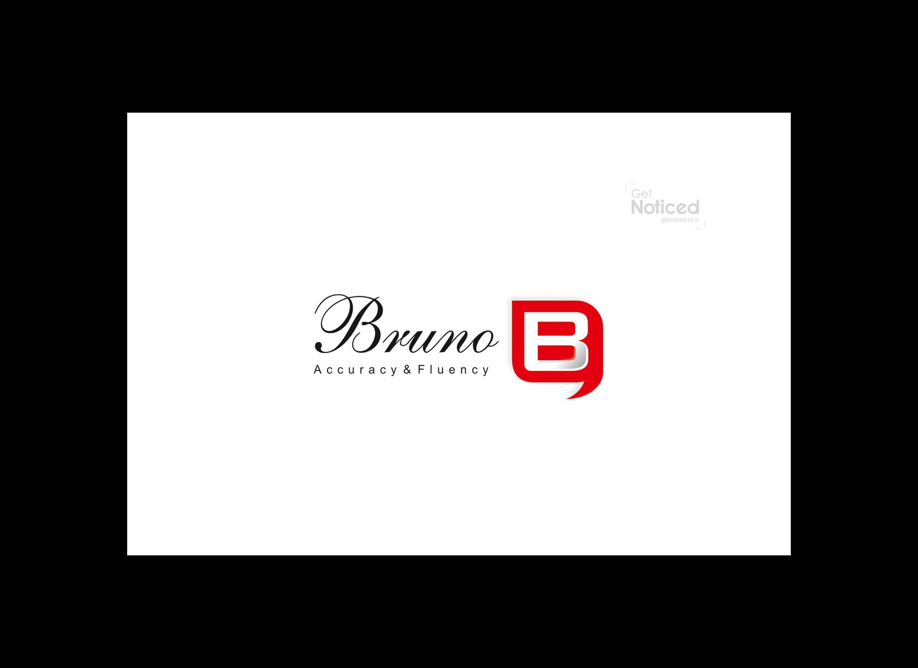
Considering the nature of Bruno's business, which revolves around teaching people to speak English fluently, we opted to incorporate a talking symbol into the design. By merging the first letter of their name, the "B," inside the talking symbol, we were able to create a visually striking logo that perfectly represented their brand identity.
Color plays a crucial role in capturing attention and evoking emotions. To ensure the logo stood out and attracted viewers, we chose a vibrant shade of red. This color has a natural ability to grab attention and elicit a sense of excitement and energy. By integrating the red color into the logo, we aimed to instantly captivate the audience and create a lasting impression.
With careful consideration of the client's expectations, the incorporation of a talking symbol, and the attention-grabbing use of color, our creative designing team presented the final logo to the client. Their response was overwhelmingly positive. The logo not only encapsulated Bruno's vision but also resonated with their target audience, effectively conveying their commitment to English language training.
i
in conclusion, the journey of crafting a logo for Bruno English Speaking Training Center was a meticulous process that involved understanding the client's expectations, creating multiple samples, and carefully selecting the most fitting design. By incorporating a talking symbol and utilizing an attention-grabbing color, our creative designing team successfully captured Bruno's essence and created a logo that left a lasting impact.


