Hey Granny Logo Design
Handled: Logo Design, Education & Training
Client Name: Hey Granny
Industry: English Speaking Academy
City: Coimbatore, Tamilnadu
Country: India
Introducing Hey Granny: Empowering English Learning with a Captivating Logo
Introduction: In the fast-paced world we live in, effective communication in English has become an essential skill. Recognizing this need, the creative team at Hey Granny, an English Speaking Academy, has designed a captivating logo that embodies the brand's mission to help individuals overcome fear, hesitation, inferiority, and speaking difficulties. With a personalized English training program and a psychology-driven approach, Hey Granny empowers learners to speak English fluently and naturally. Let's dive into the logo design, which features a charming character of a granny, crafted with meticulous attention to detail.
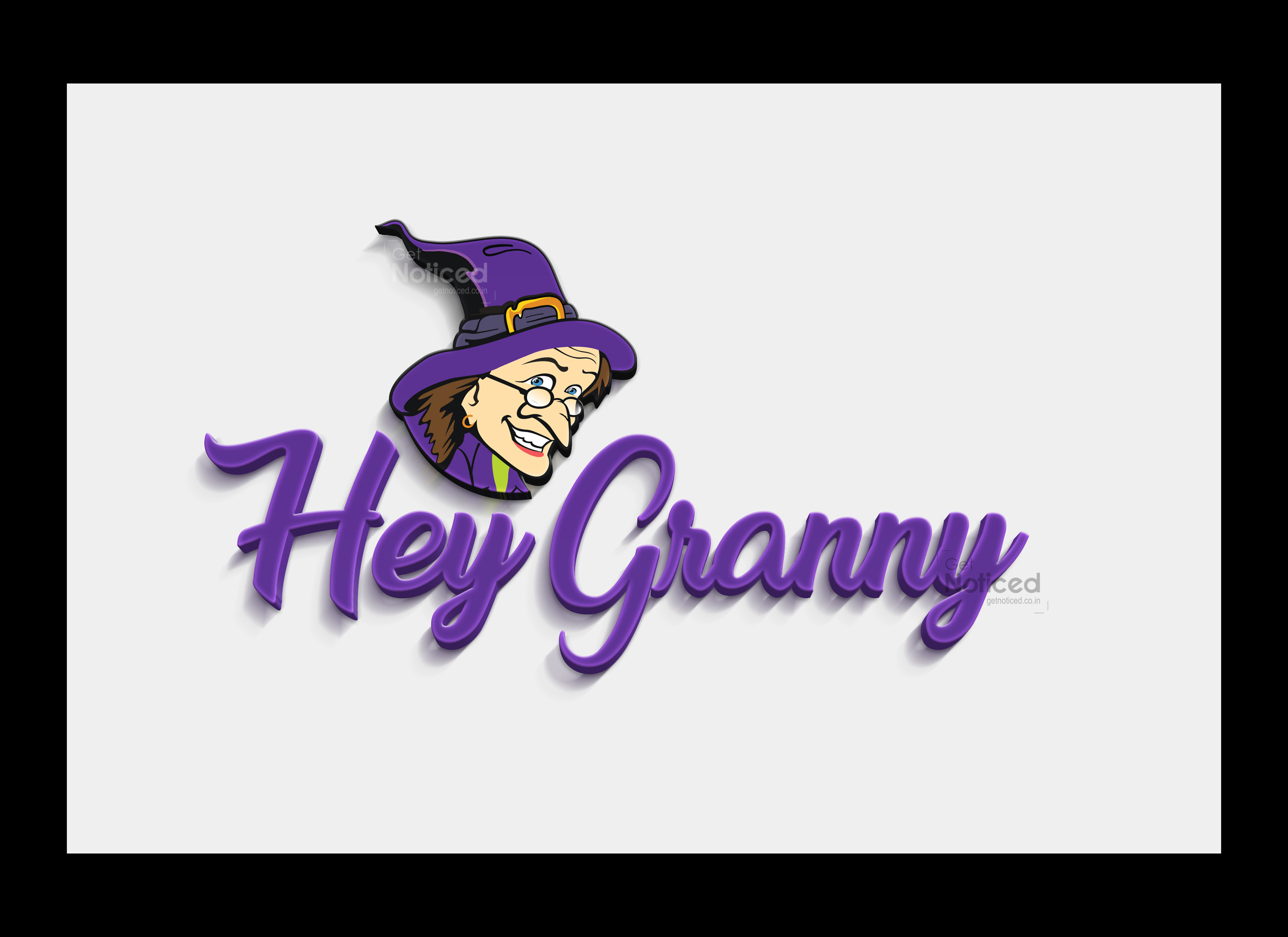
Symbolism and Concept: The Hey Granny logo encapsulates the essence of the brand's nurturing and supportive environment for English learners. The inclusion of a granny character in the logo serves as a metaphor for wisdom, experience, and guidance. It conveys the idea that learning English with Hey Granny is like having a knowledgeable and caring grandmother by your side, guiding you through the process of language acquisition.
The granny character is depicted with a warm and welcoming smile, instantly evoking feelings of comfort and encouragement. The use of vibrant colors, such as shades of blue and yellow, adds a sense of energy and positivity to the logo. The granny's friendly appearance aims to alleviate any apprehension or inferiority complex that learners may have about speaking English, fostering a relaxed and conducive learning environment.
Typography and Font Choice: The typography in the Hey Granny logo is clean, modern, and easily readable. The font chosen strikes a balance between professionalism and approachability. A combination of bold and lowercase letters gives a contemporary and dynamic touch to the overall design. The brand name "Hey Granny" is prominently displayed beneath the granny character, ensuring it remains the focal point of the logo.
The tagline, "English Speaking Academy to Overcome fear, hesitation, inferiority, and speaking difficulties," is cleverly integrated below the brand name, using a smaller and slightly lighter font. This placement ensures that potential learners quickly grasp the essence of Hey Granny's mission, which is to help individuals conquer their language-related challenges.
Logo design by our get noticed tem for Hey Granny's. Mission: The granny character in the logo effectively communicates the nurturing and caring environment that Hey Granny strives to provide to its students. By featuring a granny as the brand's symbol, Hey Granny reinforces its commitment to supporting learners in overcoming their fear and hesitation when it comes to speaking English. The character becomes a relatable figure, embodying the wisdom and guidance required to speak English fluently and naturally.
Conclusion: The Hey Granny logo is a testament to the creative team's ability to capture the brand's essence in a single visual representation. The inclusion of a granny character conveys warmth, experience, and support, setting the tone for a positive and empowering English learning experience. Hey Granny's personalized English training, psychology-driven approach, and flexible timings, combined with the logo's charm, make it a brand that resonates with English learners seeking to overcome their language barriers.
With Hey Granny's innovative methods and commitment to creating a comfortable learning environment, learners can confidently embark on their journey towards fluency, knowing they have a caring granny by their side every step of the way.


