Momentum Logo Design
Handled: Logo Design, Education & Training
Client Name: Momentum
Industry: Personality Development Academy
City: Chennai
Country: India
Other designs handled for Momentum
Crafting Momentum: The Story Behind the Logo for the Training Institute by get noticed team
Introduction: Creating a captivating logo that embodies the essence of a brand is no easy task. When Momentum, a leading training institute focused on enhancing English speaking skills, approached our creative designing team, we embarked on a journey to craft a logo that would not only capture the spirit of the institute but also leave a lasting impression on its audience. Through collaboration, research, and careful consideration, we were able to deliver a logo that perfectly aligned with Momentum's vision and values.
Understanding the Requirements: To begin the logo design process, our team engaged in a comprehensive questionnaire session with the client. This allowed us to gain a deep understanding of Momentum's objectives, target audience, and desired brand identity. We identified their primary requirement: to visually represent the concept of momentum and energy while reflecting their commitment to empowering individuals to speak fluent English.
Research and Concept Development: With a clear understanding of Momentum's aspirations, we delved into extensive research to explore how we could effectively translate the idea of momentum into a visually striking logo. As momentum signifies energy and forward motion, we decided to focus on incorporating the letter "M" into the design, which would serve as a visual representation of the institute's name.
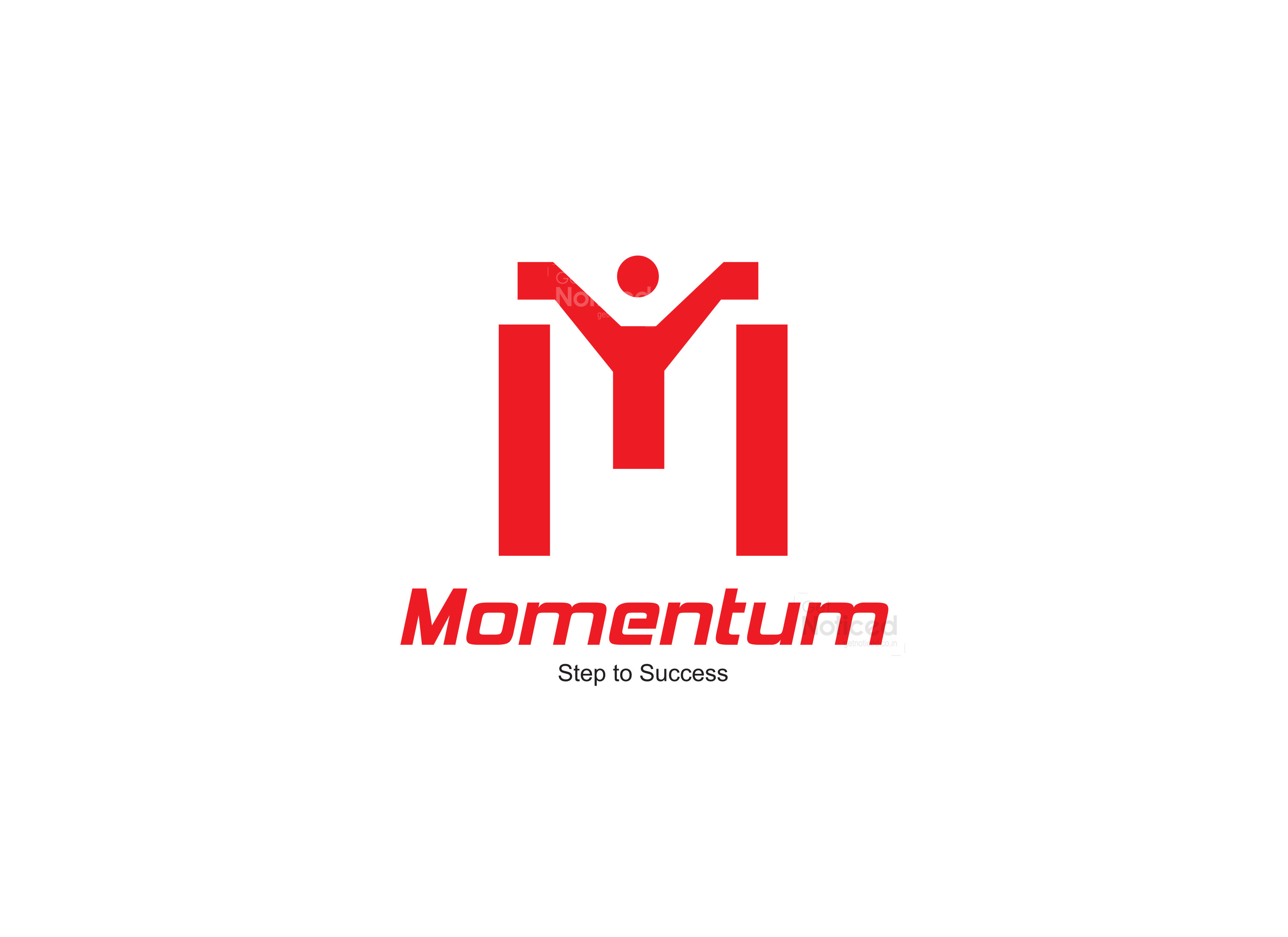
Crafting the Logo: Our design team meticulously crafted the letter "M" in a way that exuded positive energy and vitality. By using an illustrative approach, we transformed the letter into a character that conveyed the notion of uplifting energy. This design choice aimed to symbolize how Momentum's training empowers individuals to speak English fluently, ultimately elevating their positive energy and confidence.
Presenting the Options: After careful consideration and multiple iterations, we presented four distinct logo options to the client. Each design represented a unique interpretation of momentum and energy, showcasing different typographical elements and visual styles.
The Chosen Logo: Among the options presented, the client was particularly impressed by one specific design that perfectly encapsulated their vision. This chosen logo prominently featured the expertly crafted letter "M," showcasing the positive energy character and effectively capturing the essence of momentum. The design resonated with the client as it vividly portrayed the idea of progress, motivation, and the transformative power of Momentum's training.
Conclusion: Crafting a logo that embodies the spirit of a brand requires careful consideration, research, and collaboration. In the case of Momentum, our creative designing team embarked on a journey to visually represent the institute's commitment to empowering individuals to speak fluent English. By incorporating the concept of momentum and energy into the design, we created a captivating logo that effectively communicates the institute's mission. With its distinctive typography and character, the logo captures the essence of Momentum and stands as a powerful symbol of the institute's dedication to empowering individuals through language proficiency.


