Living Colors Logo Design
Handled: Logo Design, Furniture & Interior
Client Name: Living Colors
Industry: Interior Painting Solutions
City: Chennai
Country: India
Crafting the Living Colours Logo by get noticed: Unleashing Creative Excellence
Introduction: When presented with the opportunity to design a logo for Living Colours, a renowned provider of home painting solutions, our creative team embarked on a journey to create a visual representation that would embody uniqueness, professionalism, and quality. Through brainstorming sessions and meticulous attention to detail, we were able to craft a logo that stood out among the rest.
Exploring Creative Ideas: The process of logo development allows our creativity to flourish, and in this case, we sought to infuse the essence of painting into the design. We wanted the logo to be a vibrant reflection of the company's services, while also communicating a sense of artistry and individuality. Drawing inspiration from the various hues and tones encountered in the world of paint, we decided to make color the central element of the logo.
The Final Design: After careful consideration and refinement, our team presented four distinctive logo samples to the client. Each design showcased a unique interpretation of Living Colours' brand identity. Ultimately, the client selected an elegant logo that perfectly captured the essence of their business.
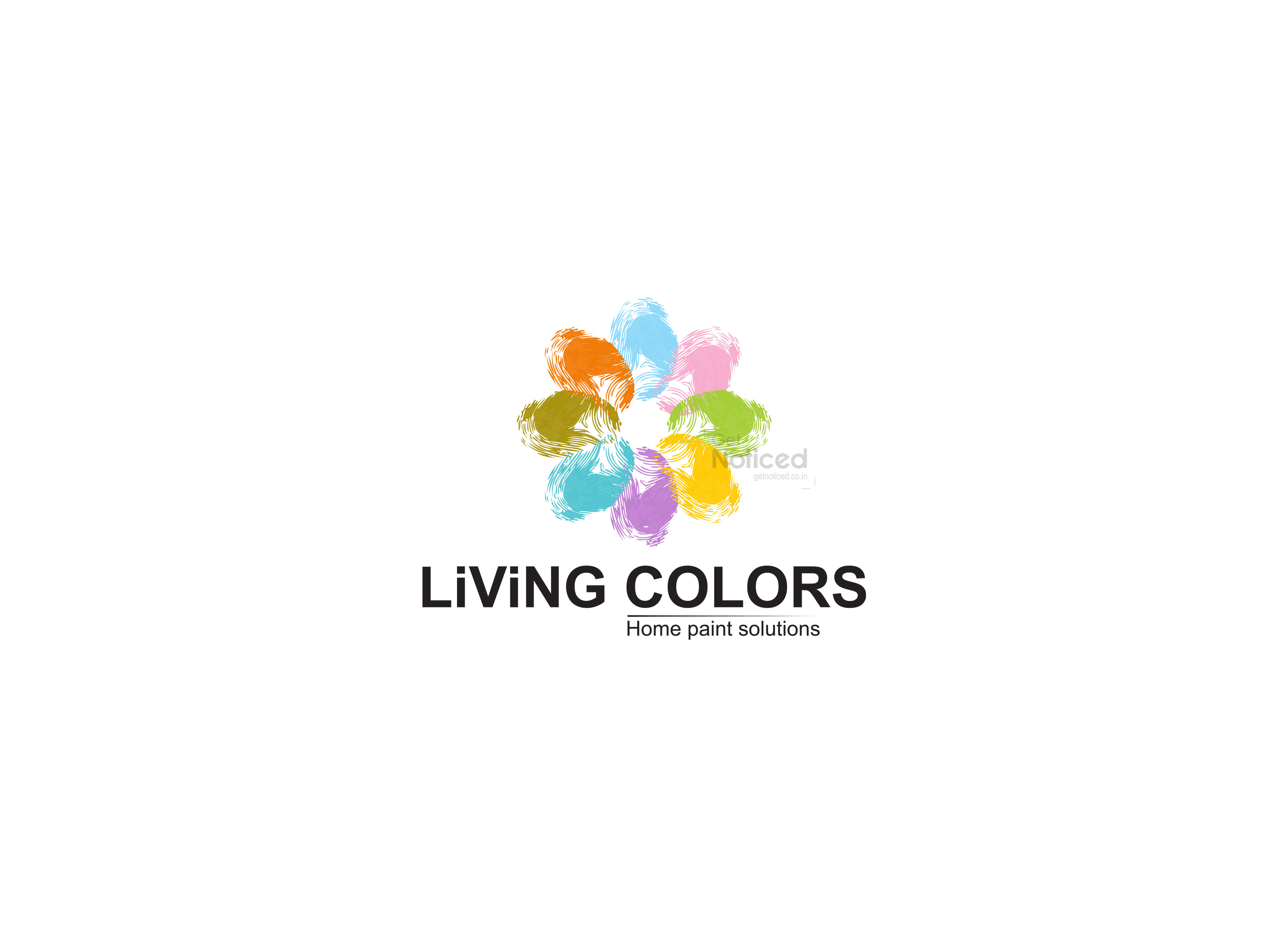
The chosen design features a circular shape, symbolizing unity and completeness. The circle is composed of thumb impressions in different colors, symbolizing the spectrum of paint shades and the multitude of possibilities Living Colours offers to its clients. This approach not only created an eye-catching visual, but it also conveyed the company's commitment to providing a diverse range of painting solutions.
The Impact: The final logo design for Living Colours not only met the client's expectations but also resonated with their target audience. It successfully encapsulates the brand's core values of uniqueness, professionalism, and quality. The vibrant colors and the circular composition communicate a sense of creativity, reliability, and expertise that sets Living Colours apart in the industry.
Conclusion: Crafting a logo is a creative process that requires careful consideration and attention to detail. In the case of Living Colours, our team's dedication and innovative thinking led to the creation of a logo that effectively captures the essence of the brand. The thumb impressions arranged in a circular shape with vibrant colors serve as a testament to the company's commitment to excellence and diversity in the world of home painting solutions. The logo is a visual representation of Living Colours' mission to bring life and color to their clients' homes.

