Lady Chef Logo Design
Handled: Logo Design, Hotel & Resorts
Client Name: Lady Chef
Industry: Catering Services
City: Nilgiris, Tamil Nadu
Country: India
Other designs handled for Lady Chef
Lady Chef Logo design our get noticed team : A Delectable Blend of Tradition and Creativity
Introduction: In the competitive world of food start-ups, branding plays a crucial role in setting a business apart from the rest. Lady Chef, a new start-up brand that focuses on delivering traditional, hygienic, and high-quality homemade food prepared exclusively by talented lady chefs, has recently caught the attention of many with its remarkable logo design. Created by get noticed team of creative logo designers, the Lady Chef logo captures the essence of the brand, highlighting its commitment to delectable cuisine and female culinary expertise. Let's delve into the key elements that make this logo truly outstanding.
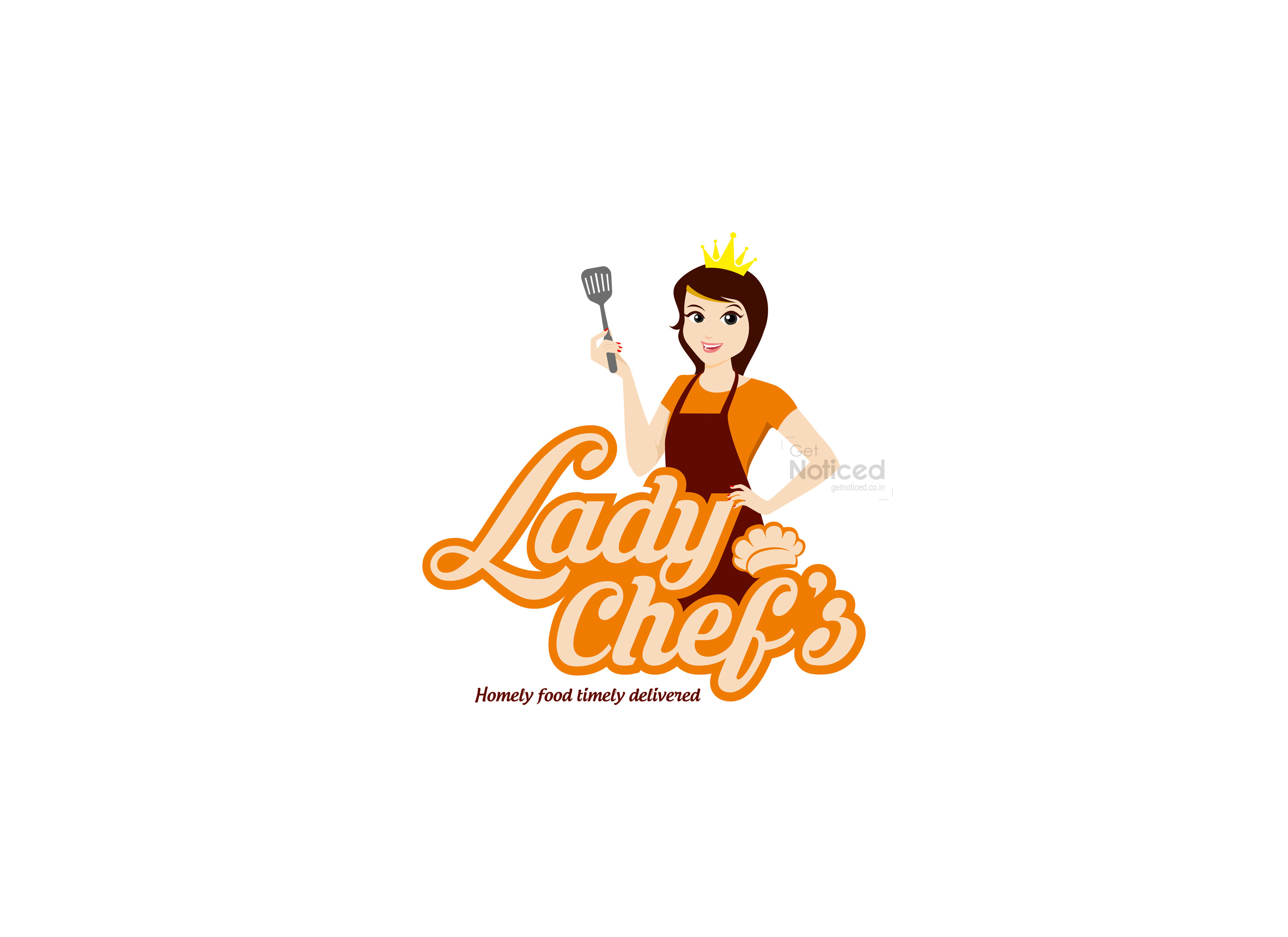
The Lady Chef Character: At the heart of the logo design is a captivating lady chef character, which serves as the brand's identity. Representing the team of skilled female chefs who prepare the delicious food, this character embodies the dedication, skill, and passion that goes into every dish. The lady chef exudes confidence and creativity, reflecting the brand's commitment to offering unique and flavourful culinary experiences.
Incorporating Calligraphy Drawing Letters: To emphasize the brand name, "Lady Chef," the logo incorporates calligraphy drawing letters. This artistic touch adds elegance and sophistication to the design while reinforcing the brand's emphasis on quality and attention to detail. The fusion of calligraphy and culinary elements creates a harmonious blend, setting the logo apart from generic designs.
Chef's Hat in the Text: In addition to the lady chef character, the logo incorporates a chef's hat within the text. Placing the hat strategically reinforces the brand's association with professional chefs and gourmet food. It serves as a visual cue that Lady Chef's offerings are prepared with expertise and precision, further establishing credibility and trust among customers.
Eye-Catching Color Combination: The color scheme chosen for the logo predominantly features the vibrant shade of orange. This color was carefully selected for its eye-catching qualities, ensuring that the logo grabs attention and stands out in a crowded market. The energetic and warm nature of orange evokes a sense of enthusiasm and creativity, reflecting the brand's dynamic and passionate approach to cooking.
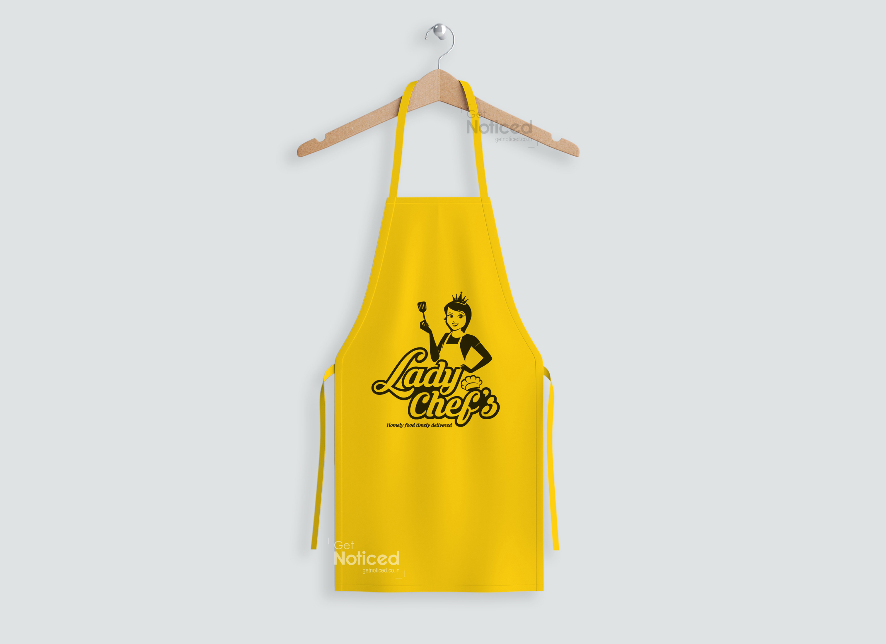
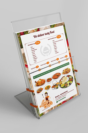
Utilization in Branding: The Lady Chef logo goes beyond its application in traditional branding avenues. In addition to appearing on marketing materials, the logo is strategically placed on chef aprons and delivery scooters. This cohesive approach to branding ensures that every touch point with the customer reinforces the brand identity, building recognition and trust. By extending the logo's presence to delivery personnel uniforms, such as caps and t-shirts, the brand establishes a cohesive visual language that leaves a lasting impression.
Conclusion: The logo designed by the get noticed creative team for Lady Chef effectively encapsulates the essence of the brand—a group of lady chefs dedicated to providing traditional, hygienic, and delectable homemade food. With its attention to detail, the logo captures the spirit of the culinary world while reflecting the brand's commitment to quality and expertise. Through the skillful integration of a lady chef character, calligraphy drawing letters, and a chef's hat, the logo creates a visually appealing and memorable representation of the brand. With the vibrant orange color palette and thoughtful utilization across various branding channels, the Lady Chef logo is sure to entice customers and establish a strong presence in the market.


