The Hidden Witch Logo Desitgn
Handled: Logo Design, Hotel & Resorts
Client Name: The Hidden Witch
Industry: Coffee Shop
City: chennai
Country: India
Other designs handled for The Hidden Witch
customised logo design our team get noticed "Unveiling 'The Hidden Witch': A Magical Logo for a Sandwich Cafeteria Brand"
Introduction: In the bustling world of sandwich cafeterias, where each establishment aims to stand out with its unique offerings, branding plays a crucial role in capturing the attention of customers. Recently, the design team at "Get Noticed" had the pleasure of crafting a logo for a new start-up sandwich cafeteria brand called "The Hidden Witch." The client's specific requirement was to incorporate a witch character into the logo, and after several revisions, the team successfully created a captivating design. This article explores the journey of the design team and the final logo that encapsulates the essence of "The Hidden Witch."
Design Process and Client Collaboration: The initial challenge for the design team was to bring the client's vision to life while ensuring that the logo represented the brand's identity. The client emphasized the inclusion of a witch character, which provided an intriguing starting point. After brainstorming and sketching various concepts, the team presented three different witch characters for consideration.
Iterative Design: Understanding the importance of aligning with the client's preferences, the design team incorporated feedback and embarked on a series of revisions. Each revision aimed to refine the witch character, making it more visually appealing and in line with the brand's desired image. The team was determined to create a design that resonated with both the client and their target audience.
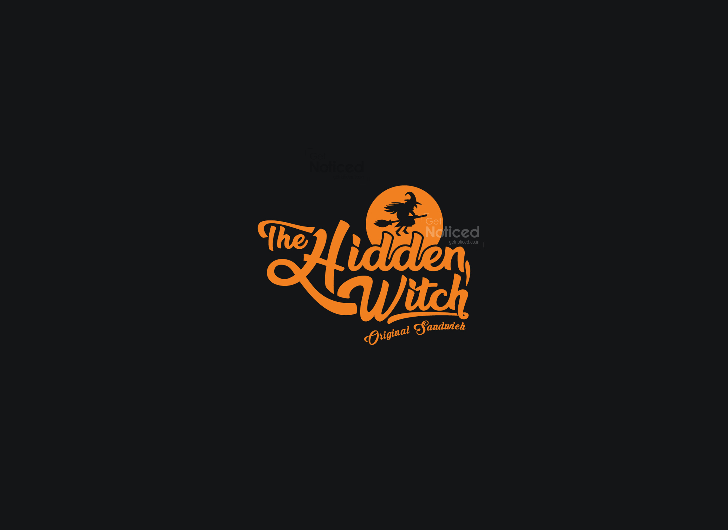
The Final Concept: After thorough discussions and thoughtful iterations, the design team arrived at a final concept that captured the magical essence of "The Hidden Witch." The chosen logo features a flying witch character, exuding an air of mystery and enchantment. The witch's silhouette showcases elegance and grace while evoking a sense of adventure. Its inclusion in the logo adds a whimsical touch that sets the brand apart from its competitors.
Typography and Color Choice: To complement the enchanting witch character, the design team incorporated pure handcrafted typography for the brand name. The carefully crafted letters reflect the brand's dedication to quality and craftsmanship, making the logo feel personalized and unique.
In line with the client's request, the entire logo was filled with a vibrant orange color. Orange, symbolizing enthusiasm, creativity, and warmth, lends an inviting and energetic vibe to the brand. This bold color choice further helps "The Hidden Witch" stand out among other sandwich cafeterias, catching the eye of potential customers.
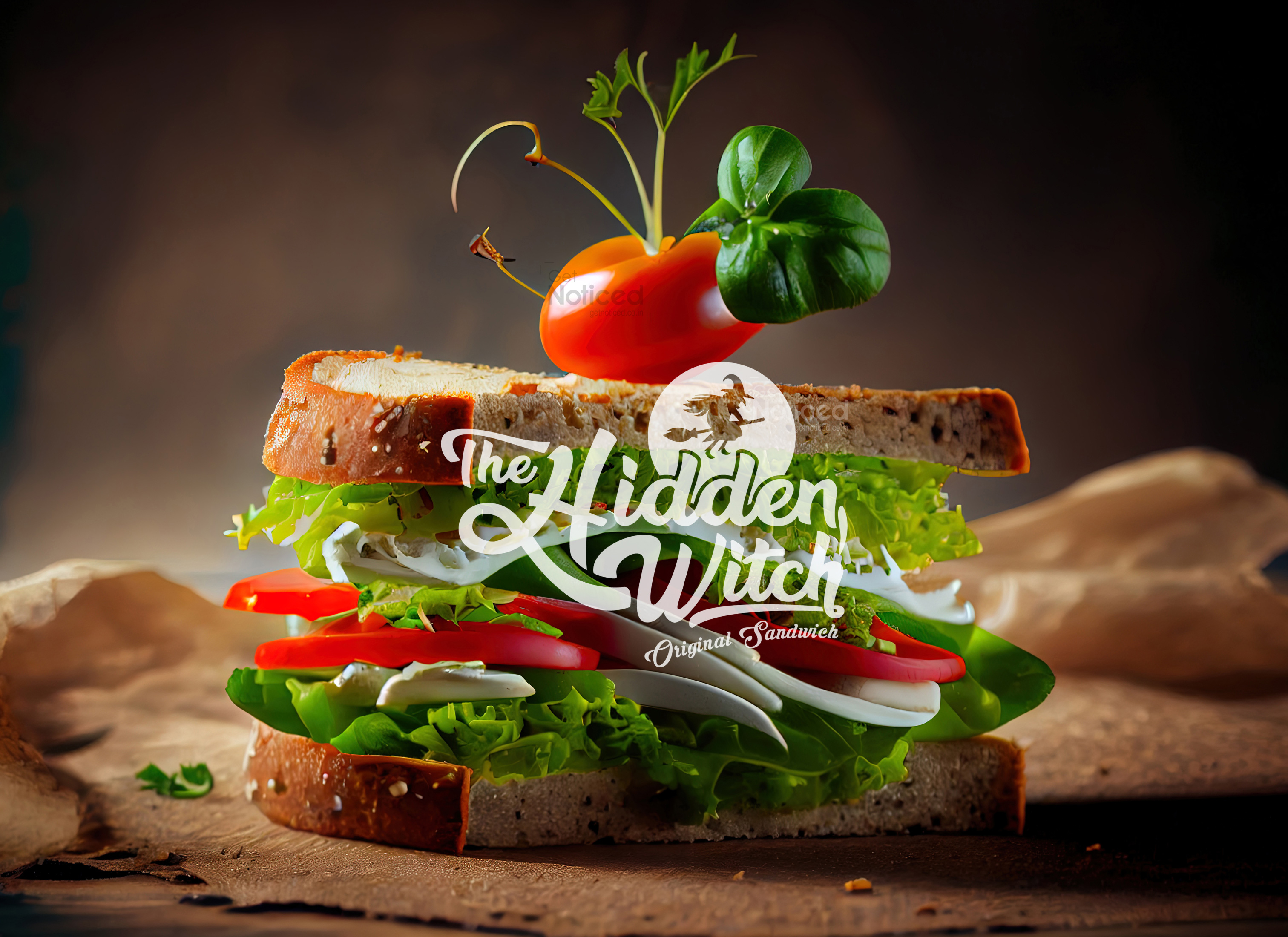
Brand Identity and Application: Beyond the logo itself, the design team ensured that it could be easily adapted for various branding purposes. From storefront signage to menu boards, packaging materials, and digital platforms, the logo seamlessly integrates into all aspects of the brand's visual identity. The consistent use of the logo across different touch points creates a strong brand recognition and recall value.
Conclusion: "The Hidden Witch" sandwich cafeteria's new logo, designed by the talented team at Get Notied, encapsulates the brand's essence with its captivating witch character and handcrafted typography. The logo's vibrant orange color, chosen specifically as per the client's request, adds a touch of warmth and energy to the overall branding. As the start-up sandwich cafeteria embarks on its journey, the logo serves as a visual representation of the brand's magical and unique offerings, enticing customers to enter the enchanting world of "The Hidden Witch."


