Farmily Logo Design
Handled: Logo Design, Nature & Organic
Client Name: Winbros
Industry: Property Builder
City: Chennai
Country: India
Other designs handled for Winbros
Unveiling the Creative Logo Design for "FARMILY": Embracing Organic Excellence designed by our logo design team get noticed
Introduction: In the ever-evolving landscape of the food industry, consumers are increasingly seeking organic and healthy products. Understanding the significance of this growing trend, our esteemed branding solution company has partnered with our prestigious client, Winbros, to create a new brand named "FARMILY." With a vision to provide purely organic foods, spices, cold-pressed oil, and vegetables, FARMILY aims to cater to the next generation's demand for nutritious and sustainable food options. In this article, we will delve into the details of the captivating logo design crafted by our talented creative team.
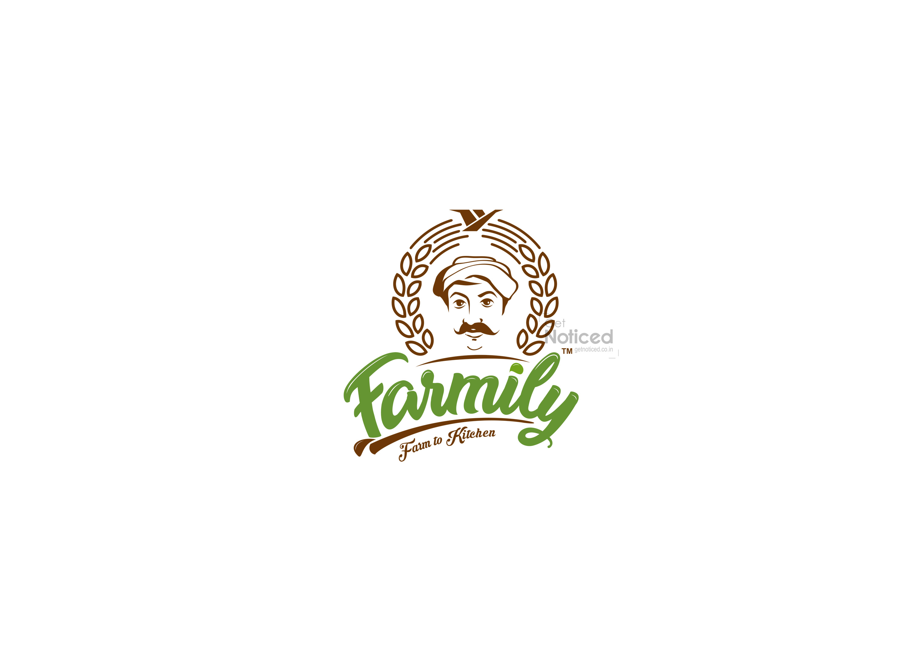
From Farmers to Family: To encapsulate the essence of FARMILY's core values, our client desired a logo that emphasizes the connection between farmers and consumers. The name "FARMILY" is a fusion of "From Farmers to Family," symbolizing the direct link between the hardworking farmers and the health-conscious families they serve.
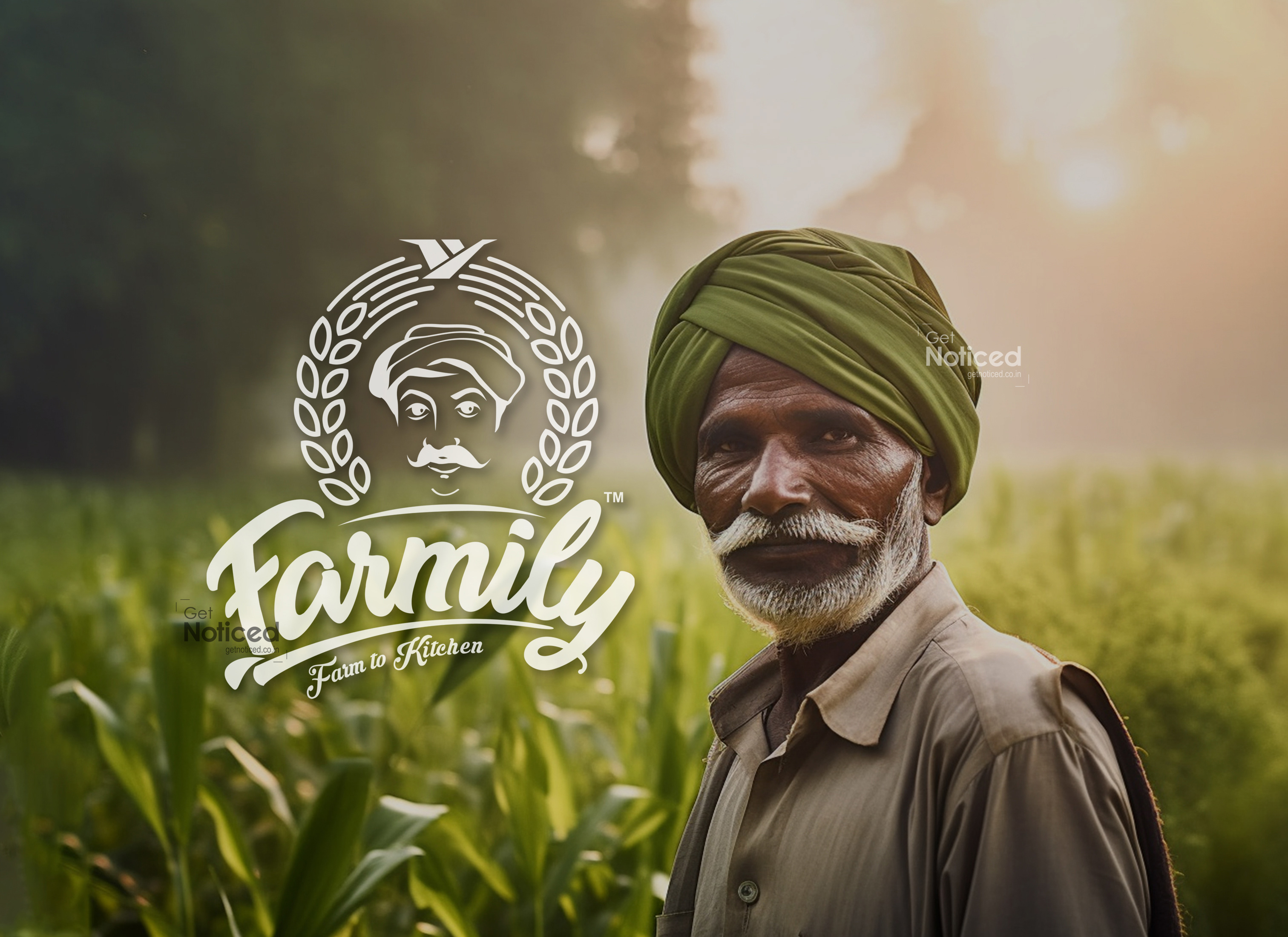
The Concept: The central element of the logo design revolves around a farmer's character, representing the dedication and care invested by the farming community. Our illustrator artist skilfully crafted a captivating farmer's face, meticulously portraying the spirit and passion that goes into cultivating organic produce. The face of the farmer is ingeniously merged with grains, forming a complete shield-like structure, signifying the protection and assurance of high-quality organic products.
Corporate Collaboration: Given the close affiliation between FARMILY and Winbros, the corporate company's logo has been seamlessly integrated into the design. Placed on top of the farmer's face, the Winbros logo serves as a testament to their established reputation and commitment to excellence. This collaboration between the two brands not only strengthens the identity of FARMILY but also instils trust and credibility among consumers.
Illustrative Typography: To further enhance the uniqueness of the logo, the brand name "FARMILY" is meticulously hand-drawn using an illustrative approach. This distinctive style sets it apart from conventional fonts, adding a touch of authenticity and artistic flair. The hand-drawn letters evoke a sense of craftsmanship, reflecting the organic and artisanal nature of FARMILY's offerings.
The Power of Creativity: Having worked closely with Winbros for over 15 years, our creative team has garnered a deep understanding of their vision and preferences. The trust they have placed in our creative abilities is a testament to our consistent delivery of exceptional design solutions. With the FARMILY logo, we have once again demonstrated our commitment to capturing the essence of a brand and translating it into a captivating visual representation.
Conclusion: As FARMILY embarks on its journey to revolutionize the organic food industry, the logo design serves as an influential visual embodiment of their values and aspirations. The incorporation of a farmer's character, the collaboration with Winbros, and the hand-drawn typography together create a distinct and memorable identity for FARMILY. We are honoured to have been part of this branding endeavour and are confident that the logo design will resonate with consumers, strengthening their trust in the brand's commitment to delivering pure organic excellence.
