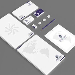
Shrisha Logo Design Shrisha Logo Design

Shrisha Logo Design

Handled: Logo Design, Real Estate

Client Name: Shrisha

Industry: Property Layouts

City: Chennai

Country: India

Other designs handled for Shrisha

Crafting the Logo for Shrisha BY GET NOTICED : A Journey of Creative Design

Introduction: Shrisha, a prominent player in the real estate industry since 2009, embarked on a quest to establish its brand identity through a unique and captivating logo. To achieve this goal, the company entrusted our creative design team with the task of creating a logo that would truly represent their vision. By employing careful research, attention to detail, and an understanding of the client's requirements, we were able to craft a logo that captured the essence of Shrisha and its global services.

Design Brief and Concept Development: In order to commence the logo design process, our team thoroughly studied the design brief provided by the client. This brief served as a guiding principle, aiding our creative team in conceptualizing the logo's direction. Drawing inspiration from the name "Shrisha," which refers to Lord Vishnu, we sought to incorporate elements that resonated with the divine power associated with the deity.

The Chakra: Symbolizing Power and Fulfilment: Given the association with Lord Vishnu, we decided to incorporate the iconic "Chakra" used by the deity in the logo design. The Chakra, renowned for its power and significance, became a symbol of Shrisha's ability to fulfil the requirements of its customers. By featuring this emblematic element, we conveyed a message of strength and reliability that resonated with Shrisha's mission.

The Global Perspective: To emphasize Shrisha's global services, we incorporated a globe at the centre of the Chakra. This addition represented the company's international reach and its commitment to providing solutions that transcend geographical boundaries. The globe symbolizes the extensive scope of Shrisha's services and its dedication to serving customers around the world.

Finalizing the Logo: Following an intensive design process, our team presented four sample logos to the client, each encapsulating the essence of Shrisha's values and aspirations. After careful consideration, the client was captivated by a specific design that effectively conveyed the desired message. The chosen logo featured the powerful Chakra, signifying fulfilment, with a globe at its core, symbolizing Shrisha's global presence.

Conclusion: Crafting a logo that accurately represents a company's identity requires a deep understanding of its values and aspirations. In the case of Shrisha, our creative design team successfully blended the spiritual connotations associated with the name "Shrisha" and the power symbolized by Lord Vishnu's Chakra. By incorporating a globe at the centre, we emphasized Shrisha's global services and commitment to fulfilling customer requirements worldwide.

Through thoughtful design and an understanding of the client's vision, we were able to create a logo that captures the essence of Shrisha and effectively communicates its core values to its target audience. With this distinct logo, Shrisha is well-equipped to make a lasting impression in the real estate industry and beyond.