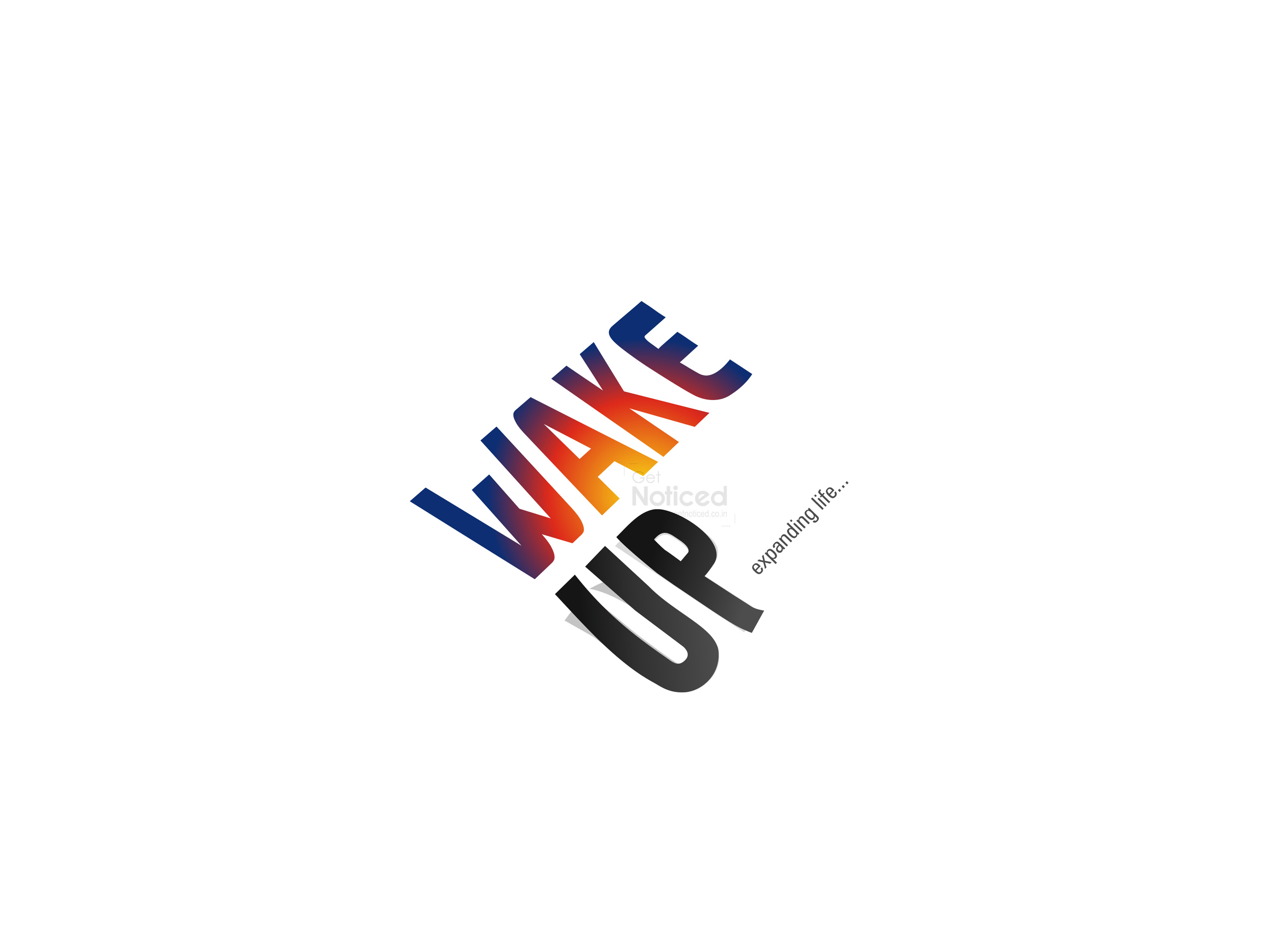
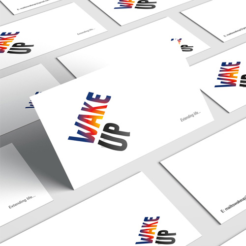
Wake Up Logo Design
Handled: Logo Design, Sports & Fitness
Client Name: Wake Up
Industry: Fitness Personal Traineer
City: Chennai
Country: India
Other designs handled for Wake Up
Wake Up : A Journey of Creativity in Logo Design by our get noticed team
Introduction: In the competitive world of fitness training, a unique brand name and an impactful slogan can make all the difference. Meet Wake Up, a small group of personal fitness trainers who not only awaken their clients' physical selves but also strive to extend and enrich their lives. This article delves into the captivating story of how the renowned creative designing team at Get Noticed crafted a logo that perfectly encapsulates the essence of Wake Up, leaving a lasting impression on both the client and their target audience.
The Birth of a Brand: When Wake Up approached the creative designing team, their first requirement was a brand name that would embody their mission and values. After brainstorming sessions and careful consideration, the team came up with the perfect name: "Wake Up." This name resonated on multiple levels, signifying the act of waking up to fitness, embracing a healthy lifestyle, and cultivating a positive mindset. It was a name that effortlessly aligned with their fitness-oriented programs.
Extending Life: A Slogan That Inspires, Alongside the brand name, the Get Noticed team suggested a slogan that encapsulated the transformative power of Wake Up: "Extending Life." This succinct yet powerful phrase captured the pivotal moment when one wakes up early or receives an awakening message, prompting them to break free from complacency and embrace a life full of vitality and purpose. It beautifully conveyed the message that by waking up and taking charge of one's health, life can be extended in multiple ways.
Alongside The Birth of a Captivating Logo: With the brand name and slogan in place, the creative designing team embarked on the task of visually representing the Wake Up brand through a captivating logo. They sought to encapsulate the meaning behind Wake Up while creating a design that would resonate with their target audience.
The focal point of the logo was the word "UP," which was skilfully crafted to resemble the shape of a sunrise. This clever play on words visually conveyed the act of waking up while symbolizing the rising sun, which is often associated with new beginnings and fresh starts. The color scheme, transitioning from a deep night blue to a vibrant sunrise yellow, further reinforced the imagery of awakening and transformation.
The Unforgettable First Attempt: As the Get Noticed team worked on multiple design options, they were struck by the sheer brilliance of their first attempt. The logo they had crafted captured the essence of Wake Up so perfectly that they decided to present it to the client right away. The team's confidence in their creation paid off, as the client was instantly captivated by the logo's symbolism and aesthetic appeal. Without hesitation, they finalized the logo, dismissing the need for further options.
Conclusion: The story of Wake Up's logo showcases the power of creative design to encapsulate the essence of a brand. The brand name, Wake Up, along with the slogan "Extending Life," set the tone for the logo design process. Through a clever play on words, the logo conveyed the act of waking up while evoking the imagery of a sunrise. The color scheme further reinforced the message of transformation and new beginnings. The Get Noticed team's commitment to creativity and their ability to capture the essence of Wake Up resulted in a logo that not only impressed the client but also resonated with the brand's target audience, setting the stage for a successful fitness journey.


