Jinkorp Logo Design
Handled: Logo Design, Tours & Travels
Client Name: Jinkorp
Industry: Travel Services
City: Delhi
Country: India
Other designs handled for Jinkorp
Crafting the JINKROP Re-design new Logo by get noticed : A Tale of Quality and Creativity
Introduction: In the realm of creative design, capturing the essence of a brand through a logo requires a careful blend of inspiration, client collaboration, and artistic expertise. This article unveils the story behind the creation of the logo for JINKROP, an esteemed provider of accommodation management and travel facilities. Led by the client's emphasis on quality, our creative designing team embarked on a journey to craft a logo that would resonate with the company's vision and values.
Understanding the Client's Vision: When JINKROP approached our team to design their logo, they emphasized their commitment to delivering exceptional quality in their services. Recognizing the significance of this core value, we assured the client that we would infuse the logo design with an enriched sense of quality, thereby reflecting their brand identity and positioning in the market.
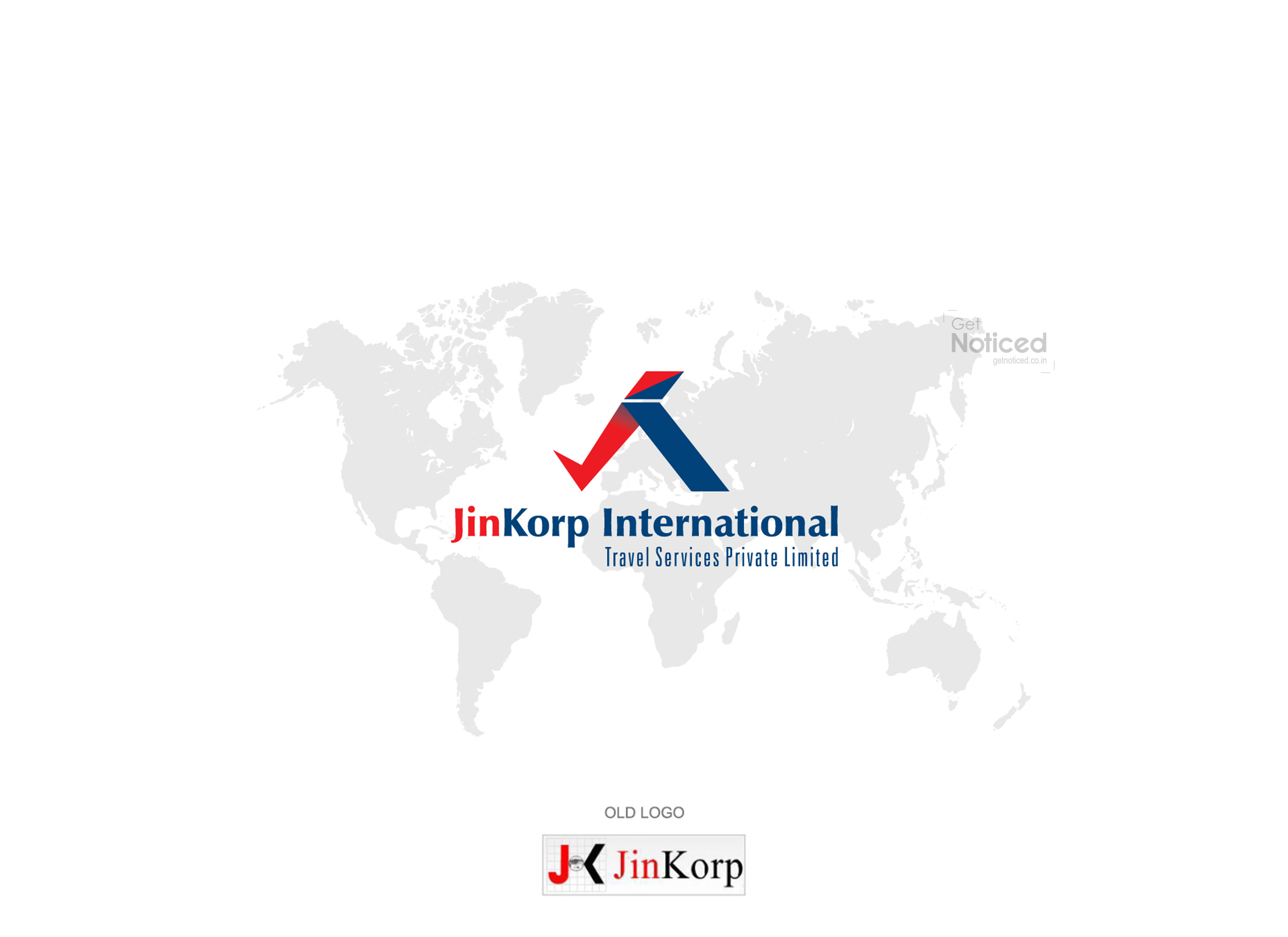
Exploring Creative Possibilities: To begin the design process, we provided the client with four sample logos, each showcasing distinct visual elements. These initial concepts aimed to evoke various emotions and establish a connection with JINKROP's industry. After thorough consideration, the client expressed their satisfaction and approved the logo depicted below, which encapsulated their desired brand image.
Brainstorming and Conceptualization: With the client's approval as our guiding light, our creative team conducted a brainstorming session to explore new ideas and translate our collective thoughts into action. Immersed in a pool of creativity, we sought to create a visual representation that encapsulated JINKROP's expertise in accommodation management.
The Birth of an Idea: During our brainstorming session, a unique concept began to take shape. Inspired by the company's focus on accommodation, we envisioned using the letters "J" and "K" to craft a hut-like structure within the logo. By merging these letters, we could subtly convey JINKROP's connection to the realm of managing travel accommodations, while maintaining a clean and visually appealing design.
The Final Design: After meticulous iterations and refinements, the final logo emerged, embodying the essence of quality that the client desired. The merged letters "J" and "K" formed the foundation of the logo, creating a stylized hut-like structure. This visual element served as a powerful representation of JINKROP's specialization in accommodation management, while also establishing a distinct and memorable visual identity for the brand.
Conclusion: Crafting a logo that accurately represents a company's vision is a delicate process, requiring a deep understanding of the client's values and an innovative approach to design. In the case of JINKROP, our creative designing team successfully translated the client's emphasis on quality into a visually striking logo. By merging the letters "J" and "K" into a hut-like structure, we captured the essence of JINKROP's accommodation management services, providing them with a logo that reflects their professionalism and commitment to excellence.


