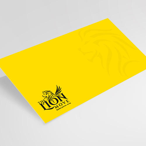
The Lion Movers Logo Design
Handled: Logo Design, Tours & Travels
Client Name: One Lion Movers
Industry: Logistics
City: Singapore
Country: Singapore
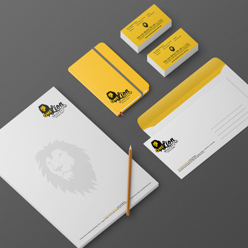
Other designs handled for One Lion Movers
Crafting the Logo Design from get noticed team for "The Lion Movers": Showcasing Singapore's Symbol of Excellence
Introduction: For over 15 years, our creative team has had the honour with one of our prestigious clients in Singapore. We take pride in being their go-to design agency for all their group of companies, handling everything from business cards to various branding and promotional materials. Recently, our esteemed client decided to venture into the logistics industry and entrusted us with the task of creating a captivating logo design for their new service. Drawing inspiration from Singapore's iconic symbol, the lion, we seamlessly incorporated the concept of "The Lion Movers" with professionalism, speed, and safety at its core.
Symbolizing Singapore's Identity: When it comes to Singapore's identity, the majestic lion reigns supreme. Recognizing this, we wanted to pay homage to the nation's symbol in our logo design. The lion's noble presence represents strength, reliability, and excellence—values that resonate with the logistics industry. By incorporating the lion into the logo, we aimed to instil a sense of trust and confidence in "The Lion Movers" brand.
Emphasizing Logistics Expertise: The primary objective of the logo design was to convey the core business of "The Lion Movers" accurately. To achieve this, we conceptualized the image of a lion, entwined with lines forming the outline of wings. These lines symbolize the seamless movement and efficiency inherent in the logistics sector. The wings signify the agility and speed with which "The Lion Movers" deliver their services, emphasizing their commitment to swift and reliable transportation.
Unique Typography: To further enhance the logo's distinctiveness, we implemented a hand-drawn letter "O" in the center of the lion's face. This personalized touch adds an artistic element and serves as a nod to our client's long-standing partnership with us. By using the hand-drawn letter, we created a unique and memorable logo that sets "The Lion Movers" apart from their competitors.
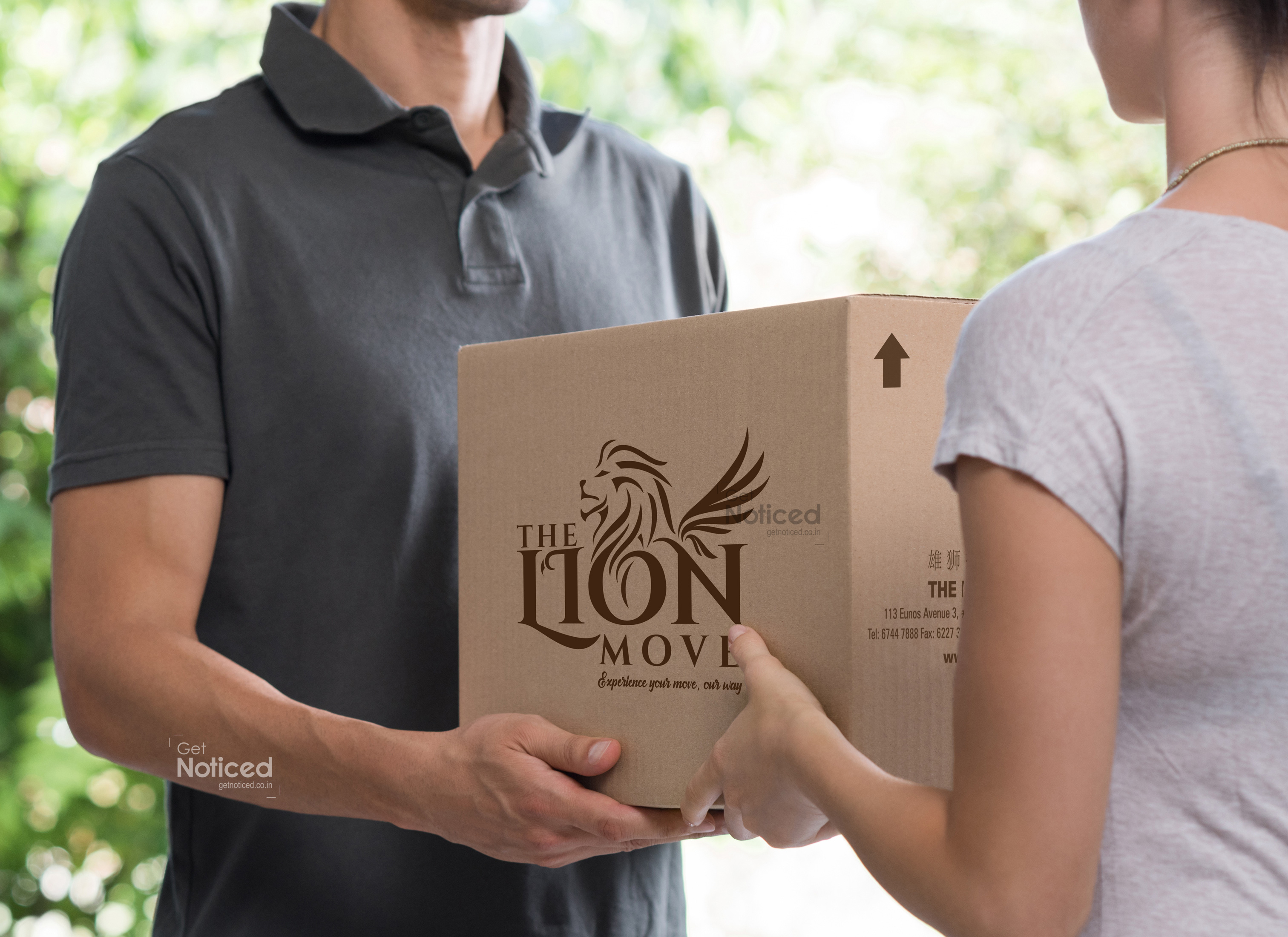
Practical Considerations: Understanding the need for cost-effectiveness, we strategically designed the logo to be adaptable for various applications. For the primary use on corrugated boxes, we opted for a single-color print, ensuring cost efficiency without compromising the visual impact. This allows "The Lion Movers" to maintain consistency in their branding across all packaging materials while being mindful of budget constraints.
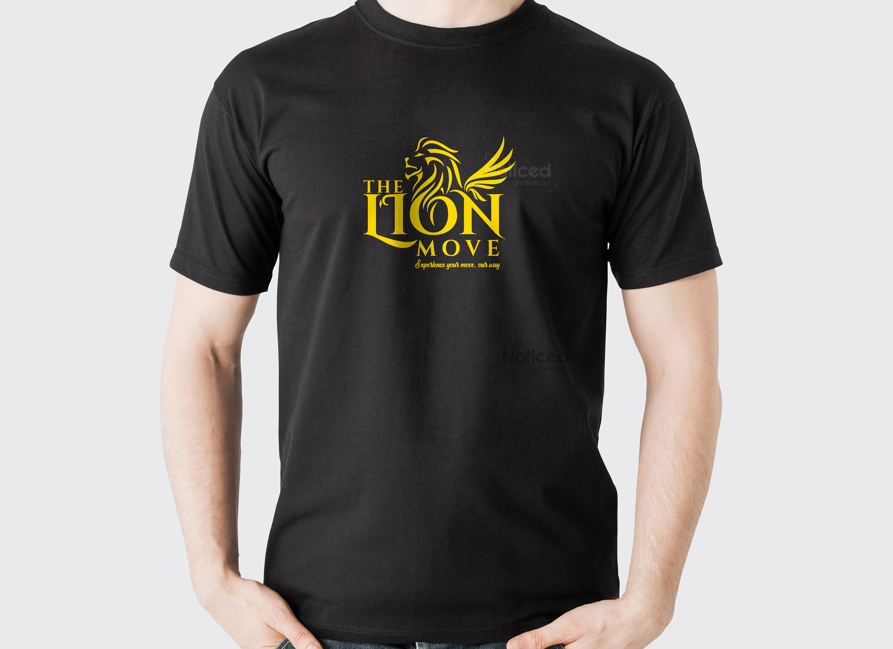
Uniformity in Branding: To create a cohesive brand identity, we extended the logo design to the attire of "The Lion Movers" delivery personnel. The logo, in its simplistic and single-color form, adorns their T-shirts, establishing a unified and recognizable visual presence for the brand. This consistency helps build trust among customers and promotes brand recall, reinforcing "The Lion Movers" as a reliable logistics service provider.
Conclusion: Crafting the logo design for "The Lion Movers" has been an exciting journey for our creative team. By skilfully integrating Singapore's symbol, the lion, with the concept of seamless logistics, we have created a powerful visual representation of our client's brand. The hand-drawn letter "LION" adds a personalized touch, symbolizing the enduring partnership between our agency and our esteemed client. With cost-effective printing options and a consistent application across various branding materials, "The Lion Movers" logo is poised to make a lasting impression in the Singaporean logistics industry.
