Karisal Wooden Cold Pressed Oil Bottle Labe Design
Handled: Packaging Design, Honey, Sauces & Oil
Client Name: Karisal
Industry: Spices And Masala Products
City: Rasipuram, Tamilnadu
Country: India
Other designs handled for Karisal
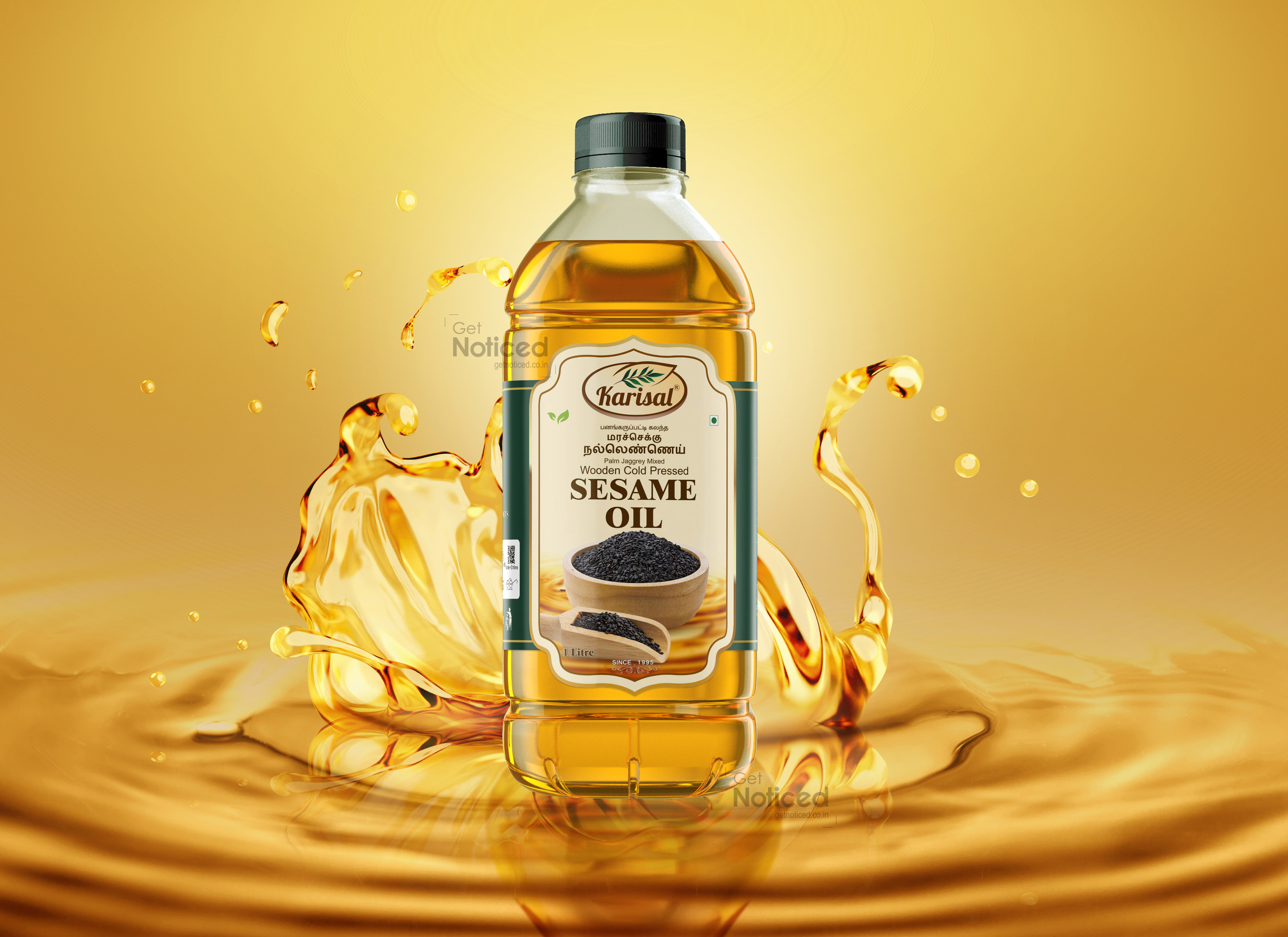
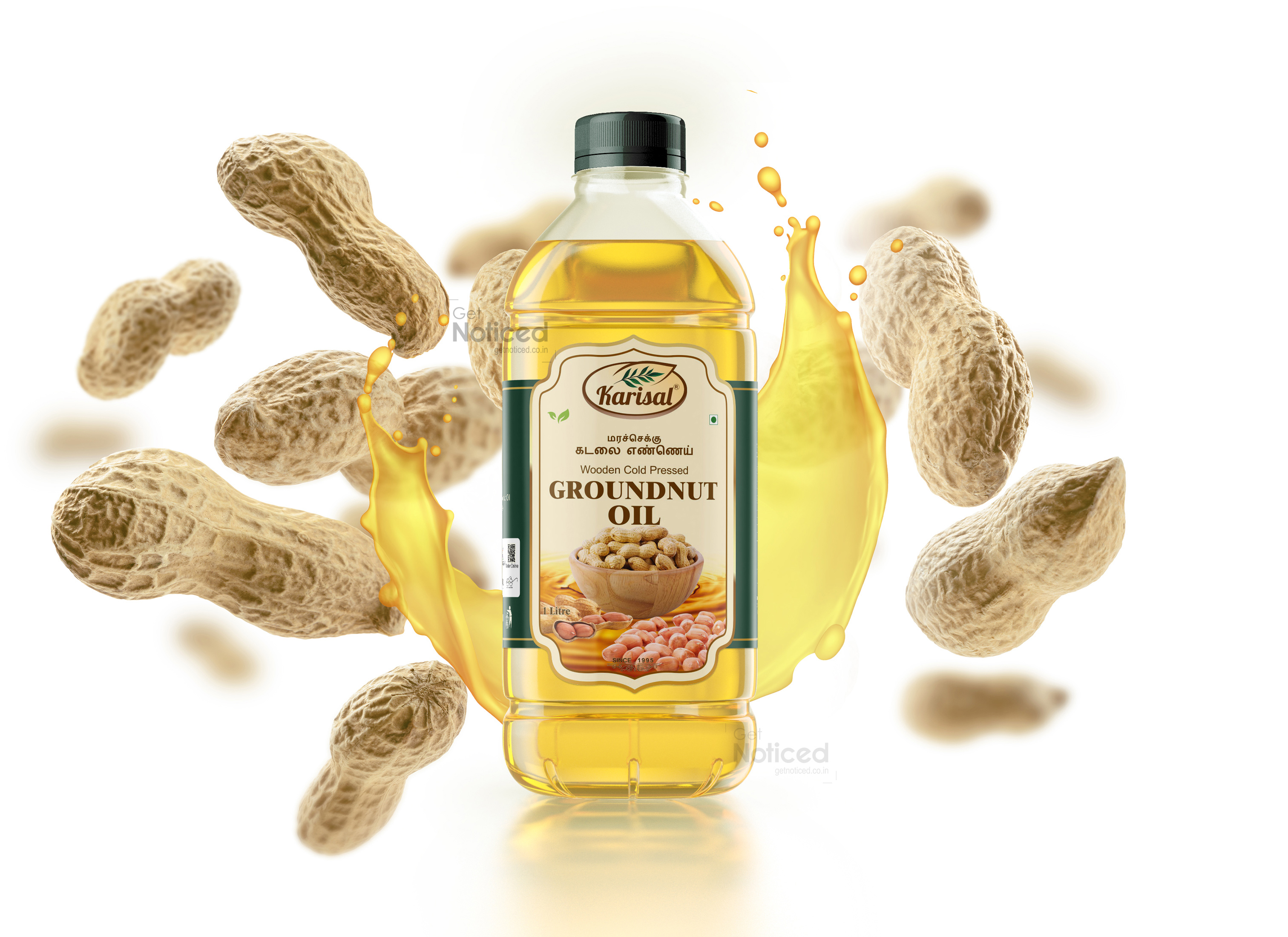
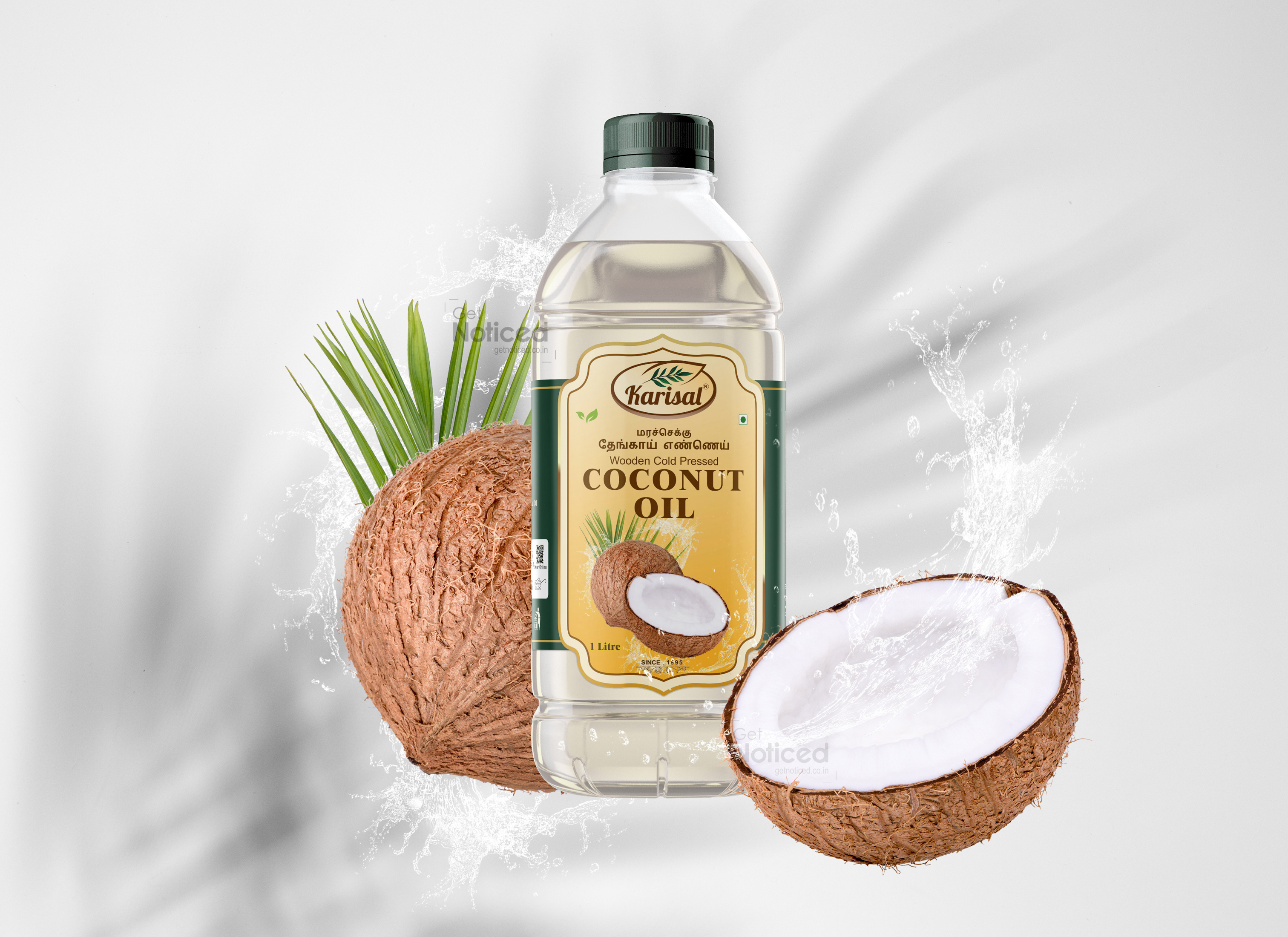
Artistic Excellence: Unveiling the Wooden Cold Pressed Oil Bottle Label Design for KARISAL Brand by Get Noticed Team
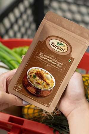
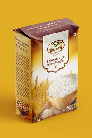
Introduction: The art of design is a powerful tool that not only captures attention but also tells a story. When it comes to packaging, the label design holds immense significance in conveying the essence of a brand and its products. The Get Noticed Team, known for their creative prowess, has once again demonstrated their design brilliance through the wooden cold pressed oil bottle label design for the renowned KARISAL Brand. Building upon their successful collaboration in the past with masala pouches and spice pouches, the team has now undertaken the task of crafting labels for three distinct oils: coconut oil, groundnut oil, and sesame oil.
A Symphony of Elements: The essence of the KARISAL Brand lies in its commitment to authenticity and purity. The wooden cold pressed oil bottle label design perfectly encapsulates these values through a harmonious blend of visual elements. The use of warm, earthy tones evokes a sense of nature and tradition, immediately resonating with consumers seeking natural products. The labels are meticulously crafted to mimic the texture of wood, creating a tactile experience that reinforces the organic nature of the oils.
Distinctive Identity for Each Variant: One of the standout features of the Get Noticed Team's design approach is their ability to differentiate each oil variant while maintaining a consistent brand identity. The label for coconut oil exudes a tropical vibe, with imagery of lush coconut groves and the deep blue sea. The groundnut oil label, on the other hand, captures the rustic charm of sunlit fields and the golden hues of harvested nuts. The sesame oil label, in a nod to tradition, incorporates intricate patterns inspired by sesame seeds, reflecting the rich heritage of this oil.
Typography and Information Hierarchy: In a world of fleeting attention spans, effective communication through design is paramount. The label design masterfully employs typography to ensure that crucial information is readily accessible. Clear and legible fonts are used to highlight the product name, while the origin of the oil and its benefits are presented in a structured yet engaging manner. The minimalist approach to typography ensures that the design remains uncluttered, allowing consumers to easily grasp the product's essence.
Cultural Narrative and Brand Recall: One of the crowning achievements of the Get Noticed Team's design lies in their ability to tell a cultural narrative through visuals. The labels celebrate the cultural significance of each oil, weaving a story that resonates with consumers on a deeper level. This narrative approach not only establishes an emotional connection but also fosters brand loyalty as consumers become a part of the KARISAL story.
Conclusion: The wooden cold pressed oil bottle label design by the Get Noticed Team for the KARISAL Brand is a testament to their creative prowess and understanding of the brand's values. With their impeccable blend of aesthetics, storytelling, and functionality, the labels serve as more than just wrappers – they are gateways to a world of authenticity and tradition. Through this remarkable design, the Get Noticed Team has once again proven that a successful label is not just about aesthetics; it's about crafting an experience that resonates with consumers and leaves a lasting impression.
