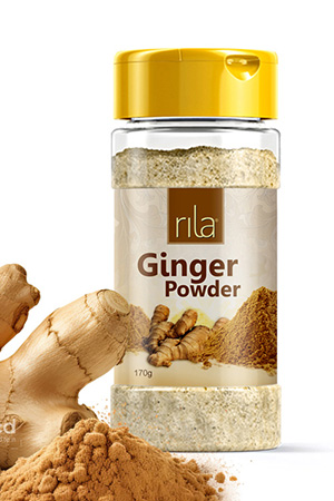
Rila Bottle Packaging Design
Handled: Packaging Design, Honey, Sauces & Oil
Client Name: Rila
Industry: Food Products
City: Selangor
Country: Malaysia
Other designs handled for Rila
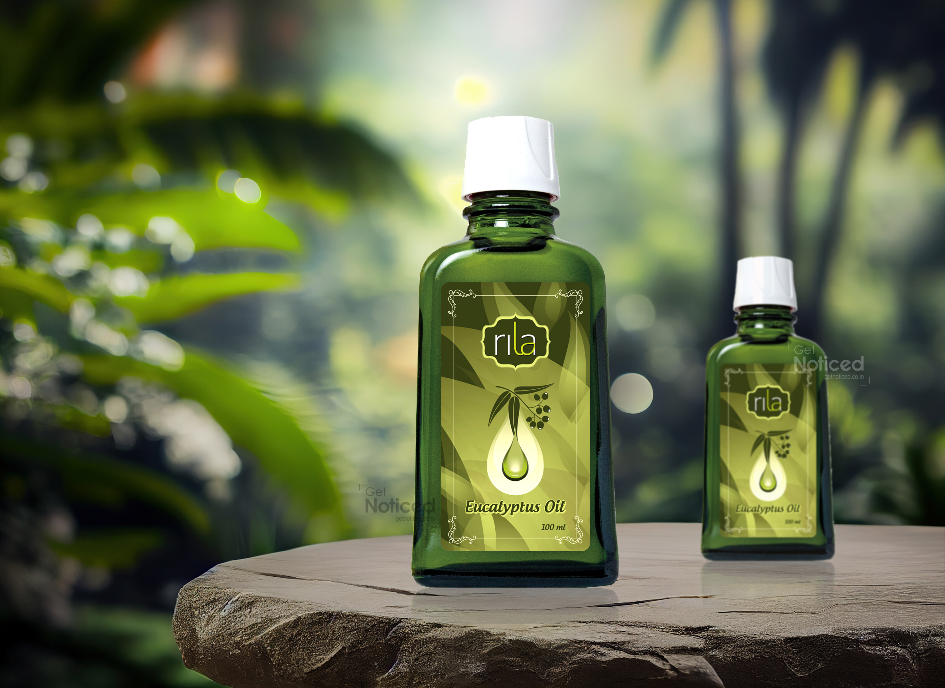
Elevating Wellness: Rila Eucalyptus Oil's Striking Packaging Label by Get Noticed Team
In the realm of wellness, Rila Eucalyptus Oil has emerged not only as a staple but as a symbol of rejuvenation and tranquility. To complement the purity and potency of Rila's Eucalyptus Oil, the Get Noticed team took on the challenge of creating a packaging label that not only communicates the essence of the product but also establishes a visual identity that stands out. The result is a label that not only encapsulates the therapeutic qualities of the oil but also showcases the brand's commitment to quality. Harnessing Nature's Essence The journey began with the Get Noticed team immersing themselves in the unique properties of Rila Eucalyptus Oil. Understanding that the product is not merely an essential oil but a wellness companion, the team set out to design a label that resonates with the brand's ethos of purity and natural goodness.
Key Features of the Packaging Label Design: Botanical Harmony: The label design for Rila Eucalyptus Oil incorporates an array of botanical elements inspired by the eucalyptus plant. Artful depictions of eucalyptus leaves and branches weave a visual narrative of nature's abundance and the source of the oil's potency.
Soothing Color Palette: To evoke a sense of calm and relaxation, the Get Noticed team chose a soothing color palette dominated by cool greens and earthy tones. This color scheme not only aligns with the natural origins of eucalyptus but also establishes a calming visual association.
Clear Typography: The choice of clear and readable typography ensures that essential information about the product, including usage instructions and benefits, is easily accessible to consumers. The font style also complements the overall aesthetic, striking a balance between modernity and natural simplicity.
Visual Hierarchy: The label design prioritizes key information, ensuring that consumers can quickly grasp the unique selling points of Rila Eucalyptus Oil. This includes the oil's purity, extraction methods, and potential uses, fostering transparency and trust.
Unveiling Nature's Healing Essence: Rila Eucalyptus Oil Label Design As Rila Eucalyptus Oil graces the shelves, the label design becomes a visual testament to the wellness journey that awaits consumers. The label isn't just a tag; it's an invitation to experience the healing and invigorating properties of eucalyptus in its purest form.
The Impact Get Noticed has once again demonstrated their ability to transform a product into an experience. The label design for Rila Eucalyptus Oil is a reflection of the brand's dedication to holistic well-being. It stands not just as a vessel for essential oil but as a visual representation of the brand's commitment to natural purity and wellness.
In a market saturated with wellness products, Rila Eucalyptus Oil, with its striking label design, stands out as an embodiment of nature's healing essence. Get Noticed has not just created a label; they've crafted a visual narrative that invites consumers to embrace the soothing embrace of eucalyptus. Rila Eucalyptus Oil is not just a product; it's a journey toward well-being, artfully captured in every detail of its exquisite label.
