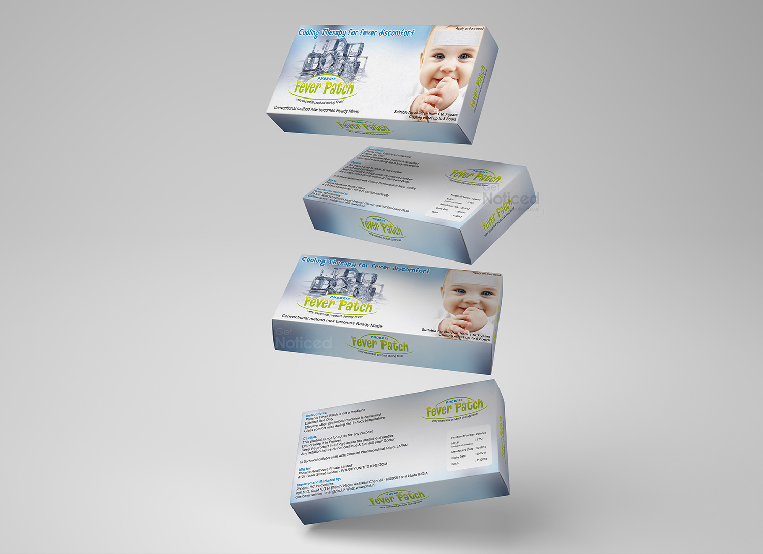
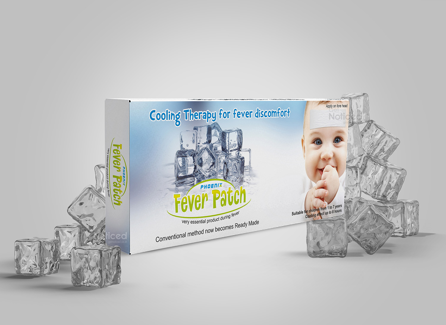
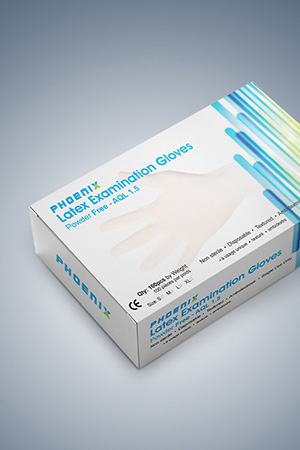
Phoenix Fever Patch Pack Design
Handled: Packaging Design, Pharma & Medical
Client Name: Phoenix
Industry: Health Care Products
City: Liverpool
Country: United Kingdom
Other designs handled for Phoenix
Cool Comfort, Kid-Friendly Style: Get Noticed Crafts the Just Kids Fever Patch Sachet Design
In the realm of children's health, Just Kids has emerged as a trusted ally for parents, and leading the charge in this visual representation is the creative ingenuity of the Get Noticed team. Tasked with the design of the fever patch sachet for Just Kids, the team seamlessly blended soothing functionality with playful aesthetics, resulting in packaging that not only delivers comfort during times of fever but also stands as a visual testament to the brand's commitment to kid-friendly health solutions.
Unwrapping a World of Comfort The journey began with the Get Noticed team delving into the unique needs of parents caring for their little ones. Recognizing that the Just Kids Fever Patch isn't just a medical solution but a source of comfort for children, the team set out to design a sachet that resonates with the brand's dedication to providing effective yet kid-friendly health products.
Key Features of the Fever Patch Sachet Design: Playful Cartoon Imagery: The sachet design incorporates whimsical and friendly cartoon characters, creating an instant connection with kids. These visuals not only capture the attention of young users but also alleviate the apprehension often associated with fever patches.
Vibrant Color Palette: A vibrant and kid-friendly color palette dominates the design, reflecting the energy and positivity associated with childhood. The choice of colors ensures that the packaging communicates a sense of comfort and playfulness, aligning with the soothing nature of the product.
Clear and Fun Typography: Essential details about Just Kids Fever Patch, including usage instructions and safety information, are presented in clear, readable, and fun typography. The font style strikes a balance between childlike whimsy and clarity, making the information accessible to both parents and kids.
Brand Consistency: The Just Kids logo is prominently displayed, contributing to brand consistency and recognition. The logo placement, along with playful design elements, enhances the sachet's appeal and reinforces the product's association with the trusted Just Kids brand.
Unveiling Pediatric Comfort: Just Kids Fever Patch Sachet Design As Just Kids Fever Patch sachets find their place in medicine cabinets, the packaging becomes a visual ambassador for the comfort and care that the product offers to young users. The sachet isn't just packaging; it's a visual representation of the brand's commitment to providing parents with a reliable solution that speaks the language of children.
The Impact Get Noticed has successfully translated the essence of Just Kids into a fever patch sachet design that not only informs but also comforts. The packaging stands as a visual testament to Just Kids' dedication to making the health journey a bit more reassuring for both kids and parents.
In a market filled with medical solutions, Just Kids Fever Patch, adorned with its charming sachet design, stands out as a symbol of comfort and care. Get Noticed has not merely designed a sachet; they've crafted a visual narrative that invites kids to embrace the soothing relief that Just Kids represents. It's not just a product; it's a visual celebration of pediatric comfort, encapsulated in every detail of its thoughtfully designed sachet.
